Discover the Insider Secrets of Million-Dollar Crowdfunding Campaigns
Some clients pay us over $1,000,000 to run their
multi-million-dollar crowdfunding campaigns. For the first time ever, we’re pulling back the
curtains and showing you how we do it.
How to develop a product everybody wants
How to get 100,000 visitors to your page
How to increase sales by over 37%
What services to use... and which ones you shouldn’t waste time on
The Kickstarter or Indiegogo Campaign Template That Drives High Conversions
06.11.2021
Welcome to the third article of the crowdfunding campaign promotion sequence. If you missed out on our previous articles, we shared some actionable tips and hacks for crowdfunding research and how you can start your campaign on Kickstarter and Indiegogo. Now is the time to understand our campaign page and get a more in-depth understanding of our Kickstarter and Indiegogo campaign templates.
The crowdfunding campaign page is your product’s official visit card. The more organized, informative, and creative it is, the higher the chances for your campaign to get more conversions.
We’ve already gone through the crowdfunding research tricks and tactics, understood how to start a Kickstarter campaign, and how the pre-launch stage of our campaign is supposed to be. Now is the time to understand how we can shine the campaign page.
What if you could create a crowdfunding campaign page in less than 1 hour without prior skills, knowledge, or experience? Some people might call it easy or even impossible. But how about having the campaign template at hand at all times?
The following article will dive deep and help you understand how we are running campaigns and how we are managing them.
The current Kickstarter and Indiegogo campaign templates are designed for creators, product owners, marketing specialists, and anyone who needs a template to start their crowdfunding campaign quickly. The template includes banner images, text blocks, and more so that you don’t have to spend hours designing your page from scratch.
It’s the bridge between your product and your potential backers. The steps described below will help you effectively organize the information on your page to ensure the highest conversion rates for your product.
Okay, shall we all proceed?
Tip #58. Create a page that has a logical flow
Analyzing various campaigns on crowdfunding platforms, we’ve noticed a common mistake pattern that creators tend to make. They have tons of videos, testimonials, and information on one page without proper order or prioritizing. This will confuse your campaign page visitors and make it difficult for them to find what they really want.
The Kickstarter or Indiegogo campaign template we’ll review today will help you better understand the initial order of your page sections. While this is a guide for you, it’s not a one-fits-all formula — each product dictates its own logic.
For instance, in the case of FUELL Fluid, we started with the introduction of the team to emphasize the ebike was designed by the legendary Harley-Davidson engineer Erik Buell. Whereas in the case of Pico, we went directly into the problem/solution of the product.
The ultimate goal should be to present the product in the simplest, most understandable, and most logical way so that all site visitors get the message you want them to receive immediately.
Once you’re done with this, focus on the marketing and design elements to make the best out of your page.
Apply the Best Marketing Principles
Marketing can make or break your product, so you should do it right. Don’t tell people what your product is about — show them it is a game-changer.
Tip #59. Play it smart — the smaller your goal, the better
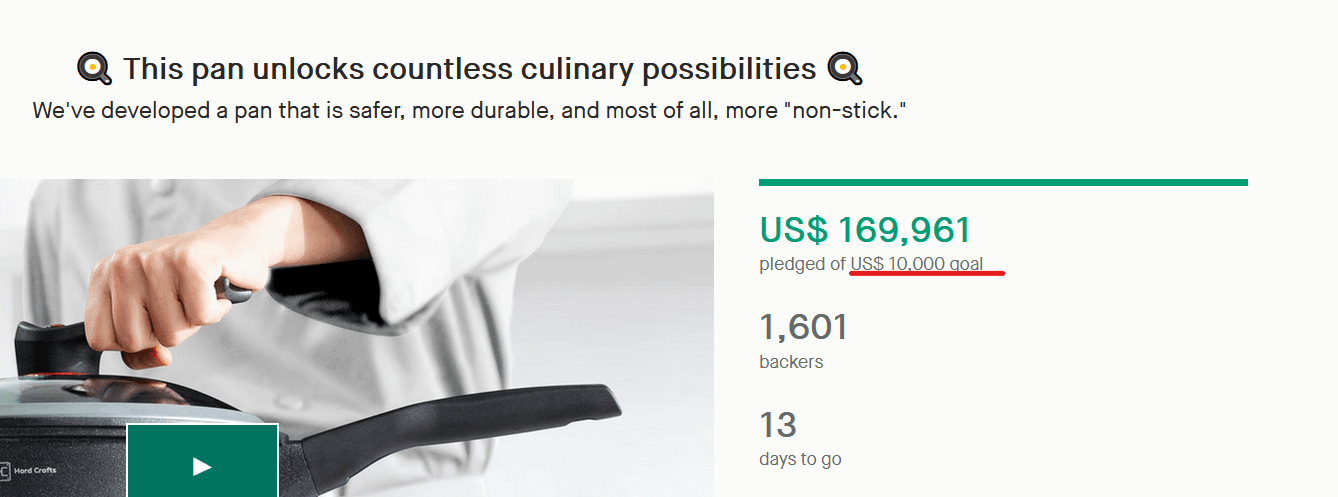
Setting the funding goal is probably one of the most important moments when creating your crowdfunding campaign. After all, you only want to reach your goal, but do your potential backers really need to know your real goal? Probably not.
The secret is that people are more likely to invest in a project that has been funded successfully and exceeded its goal 10 times over.
Nobody wants to take the risk and back something that is only 10% funded…
And the main thing that tells the backer that your campaign is successful is the bar which shows how close you are to your goal. So, set it to $25K and reach $2.5M to make your campaign more attractive by keeping your funding bar green.
Tip #60. Create unique content for your page
Though we are here to offer you the Kickstarter/Indiegogo campaign template we’ve developed and fine-tuned for through different campaigns, you are the one who decides how the storytelling will flow on your campaign page.
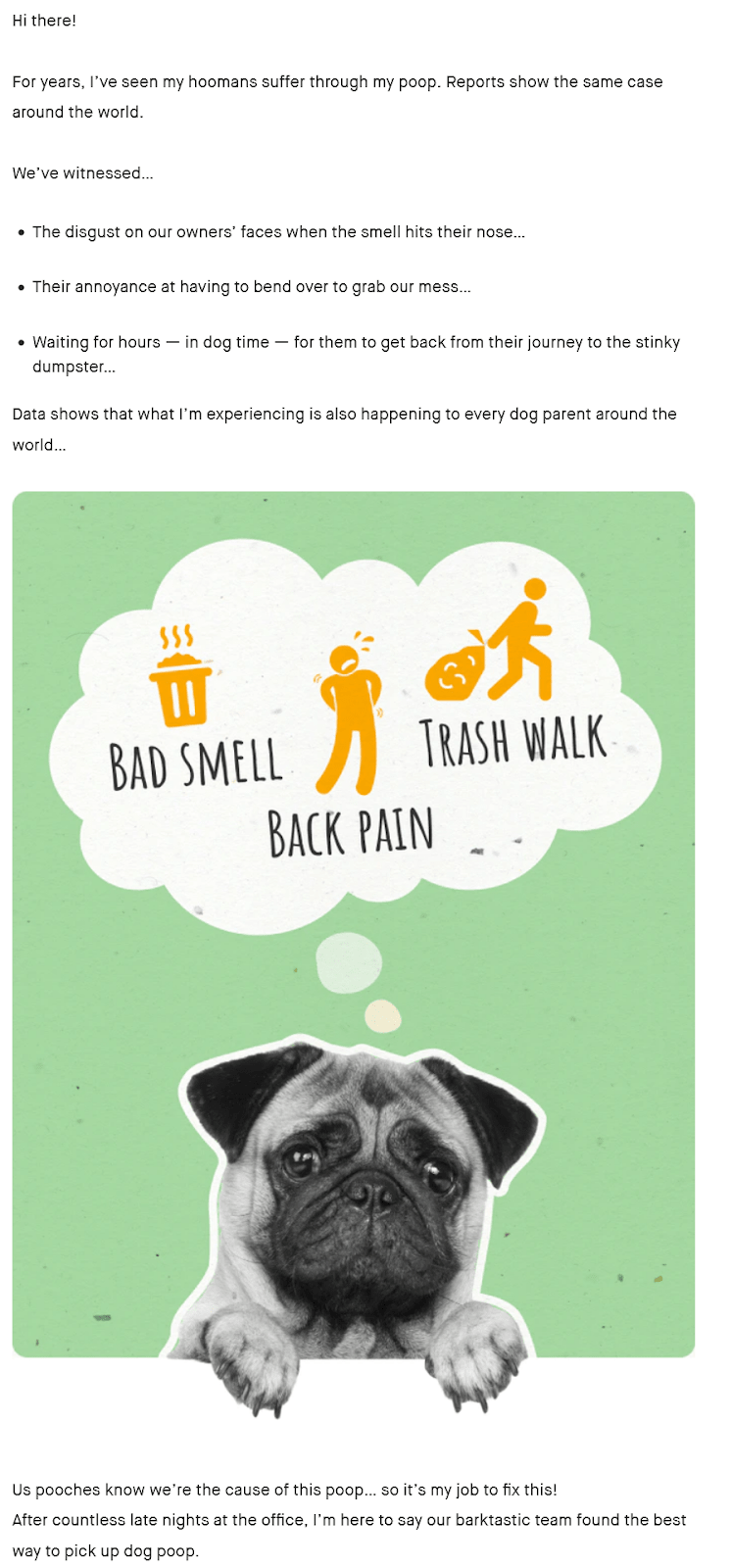
Make it as interesting and engaging as possible. One of the ways to do this is to personalize the storytelling and write as if the product user tells their story.
We’ve had highly technical campaigns that sold purely on the product’s features. But we’ve also had highly emotional campaigns that told a story from the perspective of a dog or a child.
Don’t limit your imagination here, but ensure that your approach matches your brand’s voice and your audience’s expectations.
Tip #61. Showcase the benefits rather than the features of your product
Working with creators from different nitches and analyzing our own campaign templates over and over, we bumped into one conclusion. Way too often, creators are so informed about the product that they end up covering product features…
It’s waterproof and durable, and it has over 100 cu. in. of space, it has a UV light in the 260-270nm wavelength range…
I’m sorry to tell you, but nobody cares. Why?
Because they care about themselves. And how your product can benefit them. Let me show you some examples of how you can turn your features into benefits for your audience:
Waterproof & Durable -> You can take it anywhere, you’ll never get caught stranded in the rain, and you don’t need to worry about it getting damaged and buying a new one.
It’s large -> Carry all your precious belongings, and leave nothing behind.
It’s small -> Slide it into your pocket, even on those slimmest jeans.
3 colors -> You get to choose your style
Simple? Sure. But very effective.
Tip #62. Speak to your audience about one
A common mistake among novices is to make a page about themselves or their product.
But just like you turned your product’s features into benefits, remember who you did that for… your end-user!
All your research in the early stages gave you insights into who that ideal buyer is. Now’s the time to use it.
But don’t take it too far and preach to a crowd of 1,000. No. Think about telling your friend about a cool product you just found. How would you tell them? What would you emphasize? What would they want to hear?
Be friendly, casual, informative, persuasive… and show that one friend of yours how this product will actually help them out.
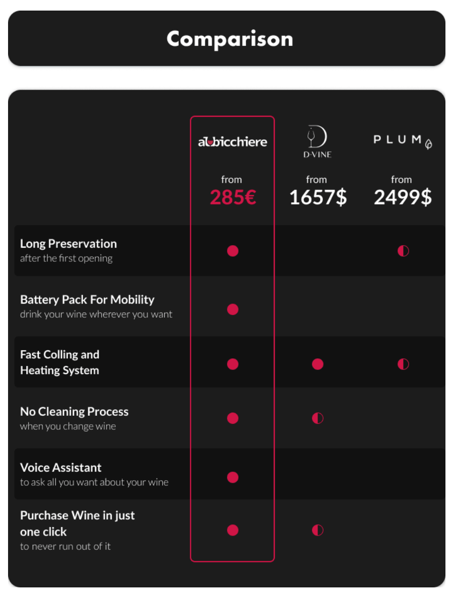
Tip #63. Include a comparison chart
Is your product better than the competition?
Show your backers!
A well-structured comparison chart or a comparison table is the most effective way to show the obvious advantages of your product against that of your competitors.
Maybe don’t include everything, but make sure to have a few instances where your product is worse than the competition to make it more credible for your leads.
Have your product stand out with a different color, and be sure it comes out on top!
Look at how we compare it with D-Vine and PLUM using different features.
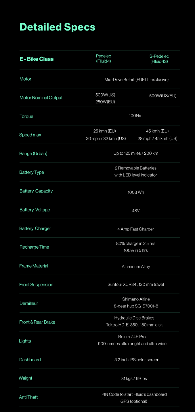
Tip #64. Add a technical specifications chart
If your product is technical — and even if it isn’t — including a technical specifications chart on your page is a good way to inform your backers of all those details you can’t expand upon in the body copy.
Weight, size, and materials. Battery life, processing power, included cables. Color, ports, distance.
You’d be surprised at all the minor details your backers want to know. So be as detailed as possible.
And as not all of your audience will be from the USA, add in the metric measurements as well.
As you can see, it includes all the main technical characteristics of the e-bike that backers need to know, expressed in metric measurements as well.
Tip #65. Show your media mentions
If authoritative media outlets are talking about your product, you should not let your backers know about that.
Include their logos, quotes from the articles, and even links to them — if they’re from top media outlets.
This gives your product much-needed social proof. Many people who visit your page may have been burned before by failed campaigns, and having the press talk about you adds a certain assurance to your campaign.
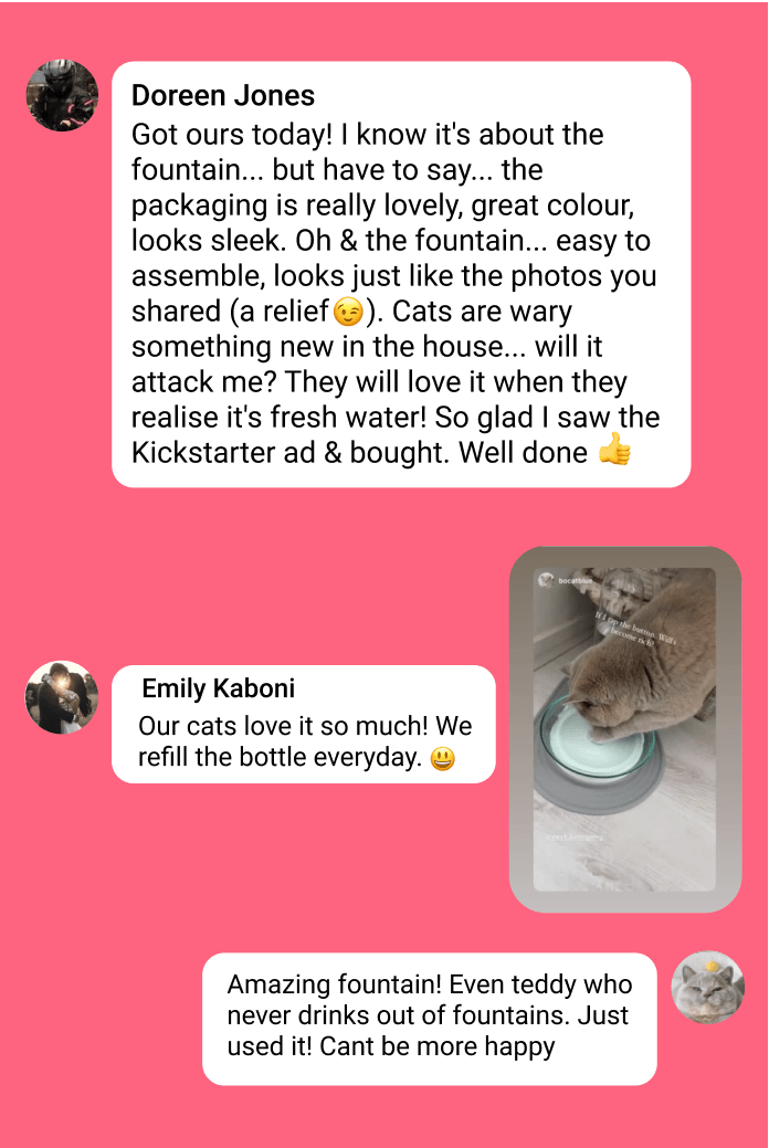
Tip #66. Include customer testimonials to improve your product’s credibility
Have you run a test production locally? Have you given it to your friends to try? Maybe this is your second campaign?
People tend to listen to others’ opinions when buying a product, so make sure to include the feedback of other users about your product on your page.
Like the press mentions, this adds credibility and social proof to your campaign — and gives visitors a voice to hear like their own.
Here’s an example from KittySpring’s Indiegogo page:
These social media testimonials from real people are really persuasive and powerful.
Tip #67. Introduce your story and your team
Crowdfunding is interesting in this respect and different from regular e-commerce.
Backers are interested in helping you, the creator, bring your vision to life.
Don’t hide behind a company name or your product. Be proud that you’re creating this, and include your story alongside pictures of your team.
It lets your backers know that you’re real people, adds a much-needed human element to your page, makes you relatable — after all, you share the same problem with your backers — and stops you from being a stranger.
This is especially important if you have a renowned team member, but is equally powerful even if you’re unknown.
Tip #68. Offer guarantees
Crowdfunding campaigns often fail. And backers are wary of this fact. They don’t want to put money into something that won’t deliver or will be a poor substitute for what you idealized on the page.
That’s why you should include satisfaction guarantees and guaranteed delivery badges.
The first is a return policy that gives backers 1-3 months to try out your product. If they’re not completely satisfied, they can return the product to you for a full refund.
The self-evident guaranteed delivery implies that if you don’t ship the product, you’ll send all your backers their money back.
Both these badges minimize the risk of buying your product for your backers. In fact, they can significantly increase the conversion rate. This was exactly the case when we added the badges on the page of one of our products — Winston.
And contrary to popular belief, not many backers will ask for a refund. With enough time to try out your product in a relaxed environment, backers aren’t rushing to find flaws with your product but enjoy using it instead!
Note: Don’t include these if you’re not planning on upholding them. The crowdfunding ecosystem relies on trust, and this should not be abused.
Tip #69. Get tracking set up on your campaign page
Make sure to integrate your campaign page with Google Analytics, the best tool to track your conversions and user behavior easily. It can be used both on Kickstarter and Indiegogo.
Another useful tool is the Facebook Pixel. It collects data that helps you measure, optimize, and build audiences for your campaigns, also using retargeting to people who have already taken some kind of action on your page.
Note: Facebook Pixel is only compatible with Indiegogo.
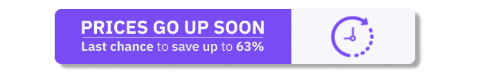
Tip #70. Use countdowns to create a sense of urgency
If you know you have a year to make a decision, you’ll put it off — there are more immediate choices you need to make!
The same logic applies to purchases. And just like Amazon always seems to only have 4 items left, you also need to push your backers to take specific action immediately.
There are many reasons why prices might go up. You might have only planned for a limited production run, or you’re producing the first 1,000 items at a loss to break into the market.
So, set yourself goals — raised amount, number of backers, time passed — and when you reach them, add a timer and tell backers that prices will go up soon.
This is an added incentive for new visitors to the page who are already interested in buying your product to not put it off until next week but get in there fast!
Note: As with the guarantees, don’t add the badge to your campaign if you’re not planning on increasing your prices. Backers will realize, feel cheated, and refund.
For example, you can use this kind of gif:
Or this kind of badge on your perks:
Design elements
People soak up visual content like a sponge. Do not waste time, energy, and resources on crafting designs that sell. The unique and thoughtful design does pay off when it comes to your page conversions.
Tip #71. Use only high-quality photos
The better your page, the more conversions it can bring. High-quality images make your product visually attractive and more likely to be noticed.
By saying high quality, we mean both the quality of the photo and its aesthetic.
Tip #72. Describe your product maximally well in your photos and videos.
You should make it possible for potential backers to learn about your product merely by looking at the pictures. Therefore, your pictures should reflect the key features of your product and show them in the best light.
Pay special attention to the first picture on your page — it is the most influential one and should thus maximally express the market positioning of your product.
Tip #73. Include short GIFs on your page
GIFs add liveliness and interactivity to your page, contributing to its better performance. But to avoid overloading the page, keep your GIFs short: they should not exceed 2 MB.
The 1.8 MB GIF is informative, attractive, and doesn’t overload the page.
Tip #74. Be super concise in your texts
People are lazy creatures who would rather look at visuals than read lengthy texts. In fact, research shows that content containing visuals performs much better than only textual one.
So our TCF Kickstarter/Indiegogo campaign template states, “When delivering your message to page visitors, try to provide maximum information with minimal text and lots of visuals.”We always tend to make the pages short, with descriptive headlines and self-explanatory visuals.
Tip #75. Don’t overload your page with disorganized content
A page overloaded with disorganized content is like an untidy room: there is not much space to move, and you don’t want to spend much time there.
In fact, 90% of crowdfunding campaign pages face this problem: On many of them, you can notice that the titles are too close to the body text or pictures, which makes it hard to group the information in mind.
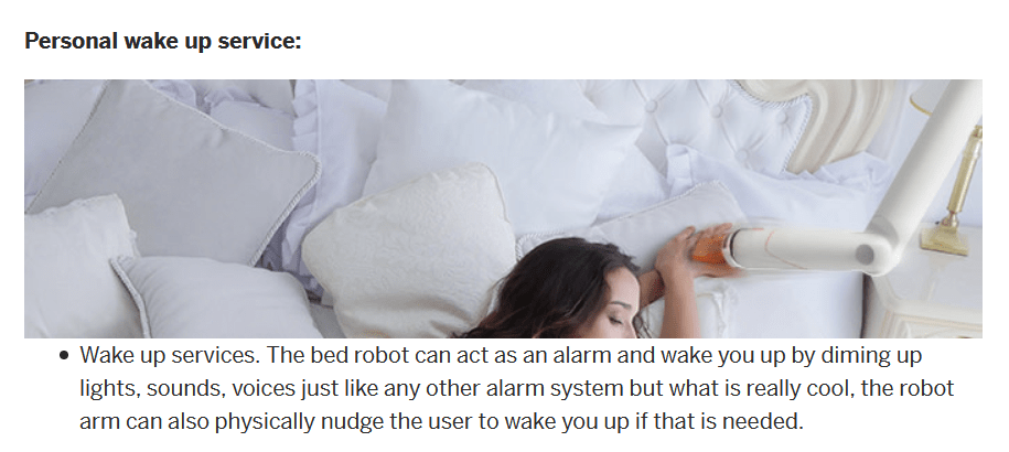
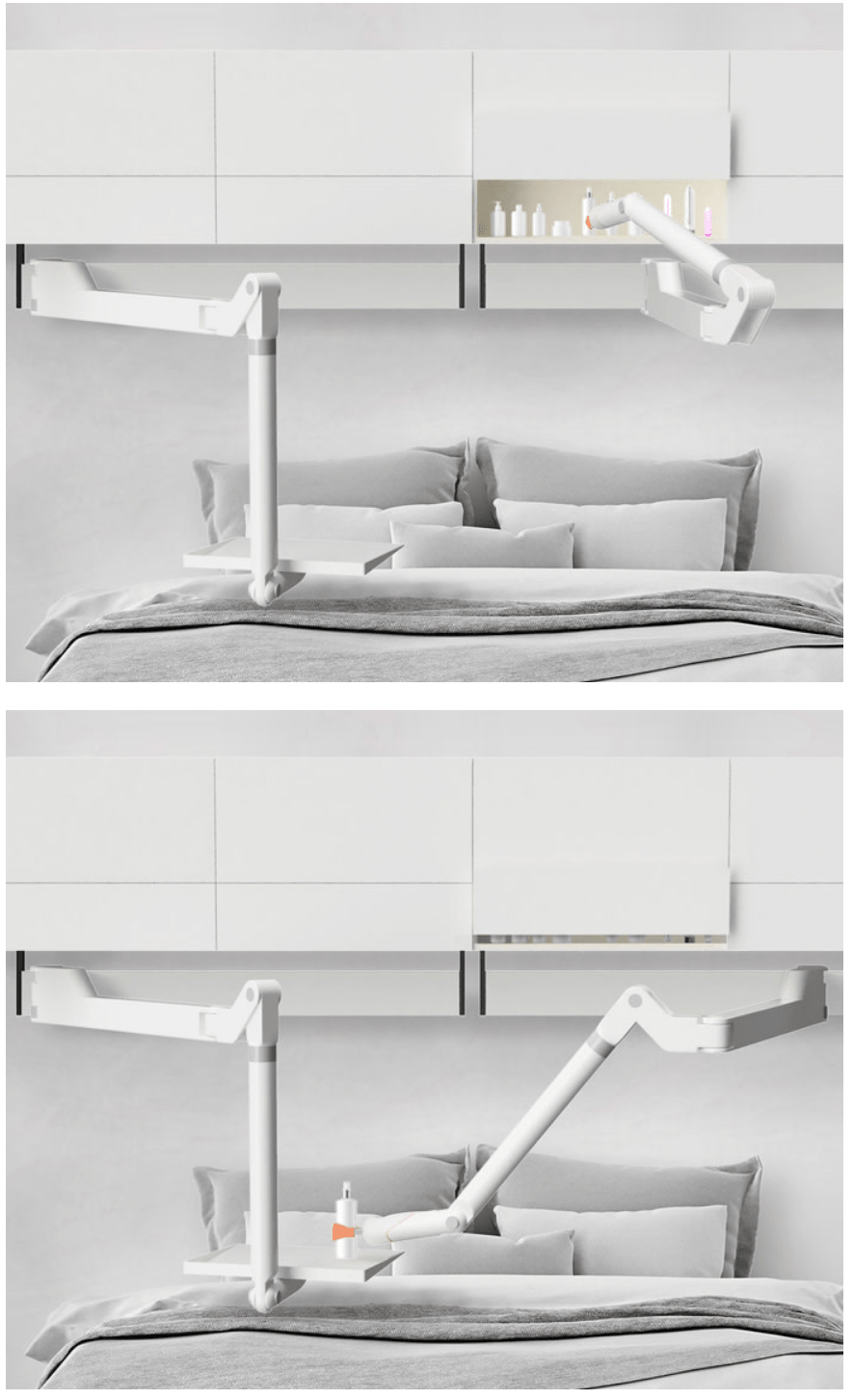
For instance, look at the following Indiegogo campaign template examples from Bed Botixs:
Here the text and the image are too close to each other, which makes it visually hard to process the information.
In another part of the page, there seems to be an overload of photos that are not separated by text. This also makes it hard for the reader to follow the logic of the message on the page.
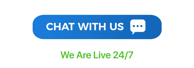
Tip #76. Add 3-4 ‘Chat with Us’ buttons throughout your page
Within the past year, we’ve upgraded the campaign template with a few functional and highly converting buttons, one of them being Chat with Us.
The Chat with us buttons is the best way to bring customer support to your page and convert your potential customers quickly. They give your backers confidence that they can get help from you whenever they need it.
The button will lead your visitors to Messenger and allow them to connect with you directly.
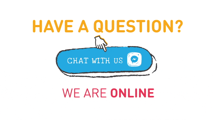
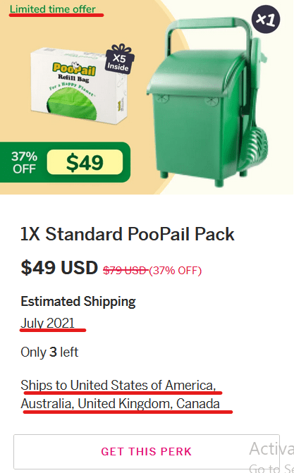
Tip #77. Include interactive CTA buttons
Your CTA buttons can be in the form of GIFs or include interactive elements such as a finger. This is an excellent way to urge your customers to click on it.
Look at these kinds of buttons on the PooPail page.
The message button and the text “We are Live 24/7” are moving, grabbing the reader’s attention and reminding them of the chance to connect directly to the seller.
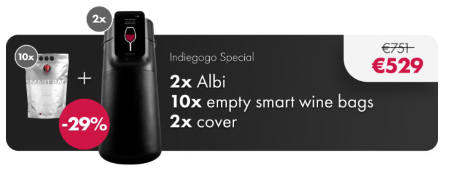
On the Albicchiere page, we found a creative solution for the CTA button, which is continuously filled with wine, just like an empty glass.
And here’s another creative CTA button from Mochi:
The hand continuously clicking on the button is pretty tempting and makes you imitate the movement and click on it.
Tip #78. Add share buttons to your page
Many campaigns make the mistake of adding their social media page buttons at the bottom (or throughout) their campaign page.
The traffic for these is essentially non-existent and useless for your campaign.
A more useful way to use your social media presence on your campaign page is to include share buttons. Visitors will share your campaign and bring more traffic to your page.
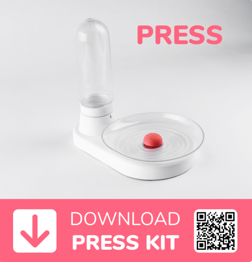
Tip #79. Add a ‘Press Kit’ button to your page
When scrolling over campaigns, you’d notice that some have special sections devoted to media outreach.
Our tested Kickstarter/Indiegogo campaign template states that you do not need an extra section for media.
The clickable button leading to your press kit will make the whole information about your product easily accessible to journalists. Check out Tip #103 for more details on what to include in the press kit.
For faster accessibility, you can add a QR code to your Press Kit, as we did for KittySpring.
Tip #80. Maintain consistency on your page
If you have chosen a certain style for your titles (e.g. uppercase writing, underlined, etc.), stick to it throughout your page to avoid confusion.
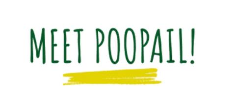
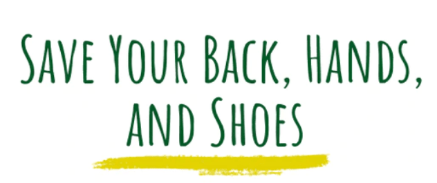
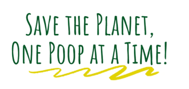
For instance, on our PooPail page, all our titles were uppercase and underlined with the help of a beautiful design solution.
Note that even if the lines are not the same, they all stick to the same style, appearing under the titles written in uppercase.
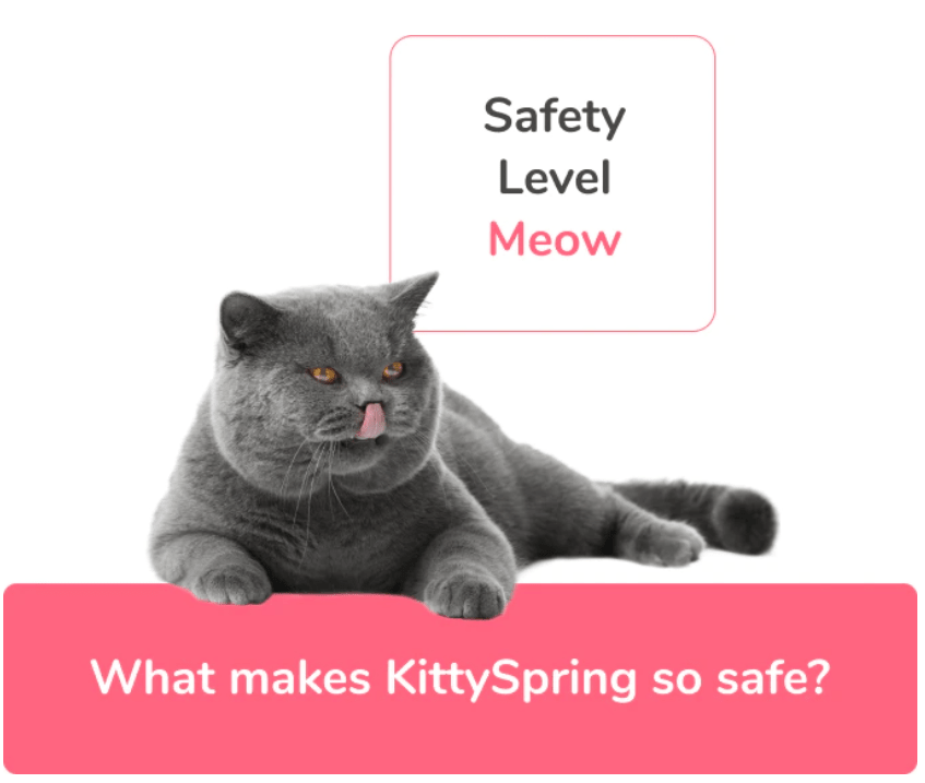
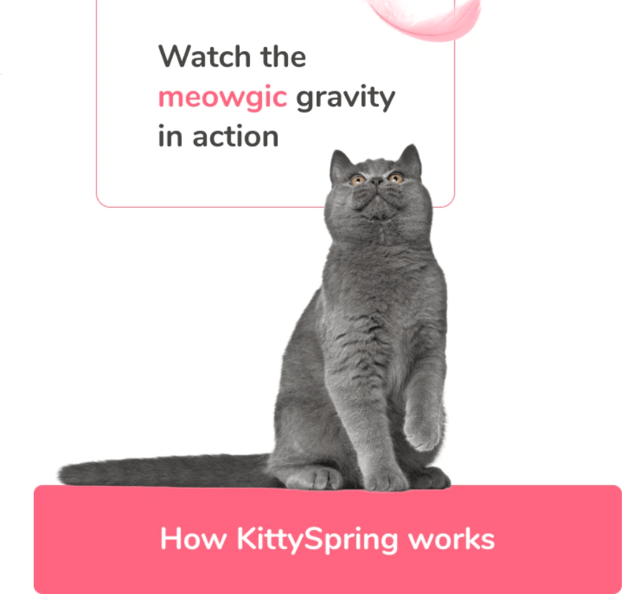
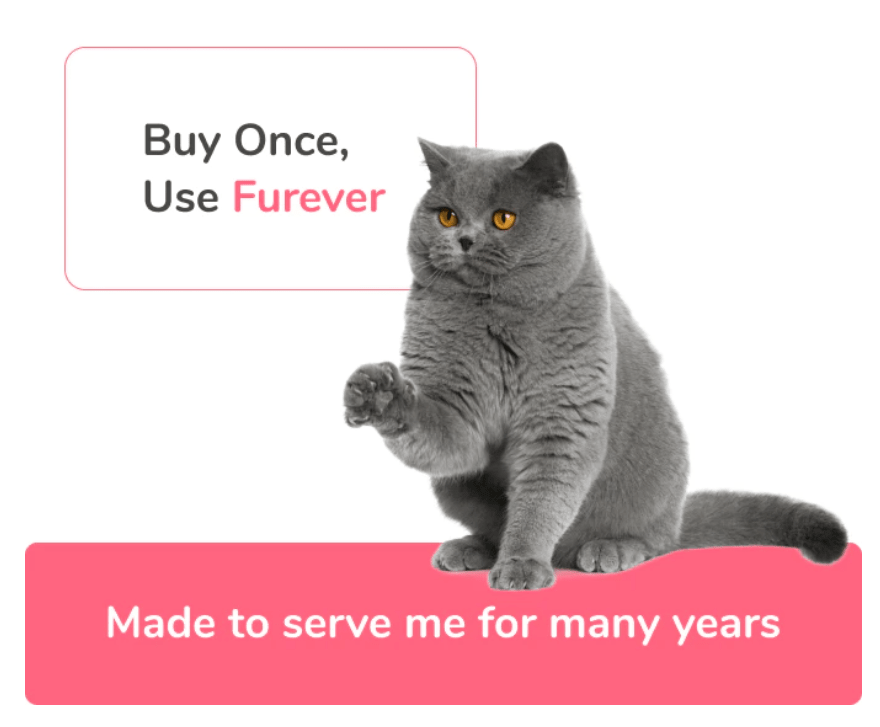
As for the Kittyspring page, here we found a unique way to convey the message of the titles through a cat language in the thought cloud and human language under it. We kept this style consistent throughout the page.
As you can see, consistency in design creates a certain pattern in the readers’ minds and makes the message easier to understand.
Perks & Rewards
Depending on the platform, rewards or perks are the best way to thank your backers for their contribution and give them something in return.
But everything is not that straightforward.
Once you reach the perks/rewards, you start wondering how much you should offer, in what way, how you can play around with the perks/rewards to get the best out of them, etc.
Well, we’ve got answers to all your questions. Read the tips below to learn the best strategies for perks/rewards.
Tip #81. Keep the quantities low.
Limit the number of rewards you offer at some levels to create a buzz. Your backers will see the reward/perk is selling out fast and start converting quickly.
Tip #82. Don’t offer too much at once.
If your product comes in five variations — five seasons of your film or five levels of your game — don’t offer all five at once. Instead, start with one or two variations and introduce other options as stretch goals.
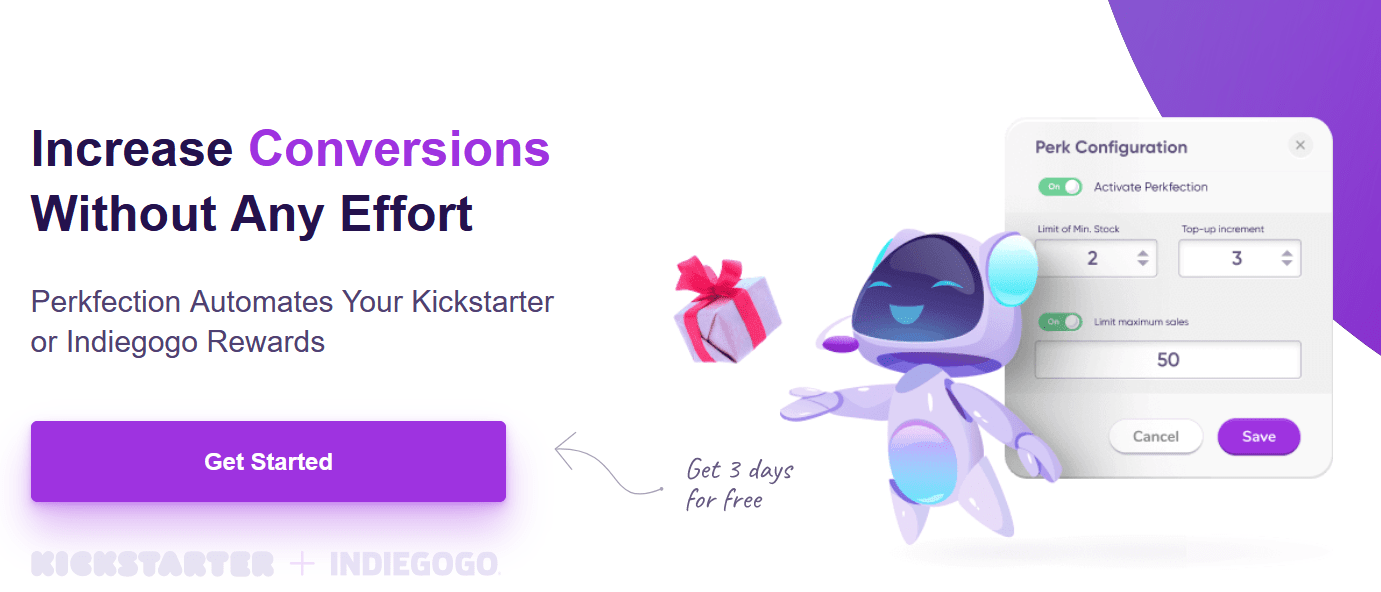
Tip #83. Automate your rewards with Perkfection
Perkfection is a tool that automatically tops up your rewards when they reach their limits. Keeping the quantities low is a great way to increase the conversion rate on the campaign page. Once the rewards reach 1-2, Perkfection automatically increases their number by 2 or 3, thus keeping the remaining rewards low with no effort from your side.
We have used Perkfection to keep the rewards always low for our project PICO. This helped us increase the conversion rate on the page by 33% and raise more than $1.4 million on Kickstarter.
Tip #84. Use high-quality and maximally descriptive pictures for your Indiegogo perks
Though Indiegogo recommends that the prices and other information not be displayed on the perks, you can follow these tips to make your Indiegogo perks section attractive:
When possible, show the number of perks in pictures. Instead of writing 2x, show 2 of your products in pictures so your potential backers can get an idea about the reward number without even reading the text.
Compare the two images below from zLight and KittySpring:
As you can see, the first one only mentions x3 zLights, while the second one is much easier to understand, showing three KittySprings immediately.
In the perks section, clearly mention important information about your product, e.g. whether it ships worldwide or to specific countries, whether it’s a limited-time offer, etc. This will help you increase your conversions.
Tip #85. Include images of the rewards/perks on your page
In addition to the rewards/perks section of your Kickstarter/Indiegogo page, we recommend placing the images of your rewards/perks on your page. That image should show your product using contrast. Also, the copy on the image should follow a certain structure::
Mention the product price and discount
Add the name of your reward
Note what’s included
In fact, the order of points 2 and 3 can be changed. For instance, there are cases when the ‘What’s included’ section is more important than the reward name.
If you are using Kickstarter, you can make your rewards clickable by adding the corresponding link to the picture.
Another important thing to consider is using correct fonts and contrast in the textual part of the aforementioned images. Remember, your rewards/perks should look attractive and readable to everyone, including people with disabilities.
Tip #86. Find the right place for the rewards/perks on your page
The position of the rewards/perks section on your campaign page can often depend on the price of your product.
If your product is relatively cheap, you don’t need too much space to convince your potential backers and thus can place the rewards earlier on your page. Conversely, if your product is expensive, you may want to take more time to show its benefits. In this case, placing the rewards down on your page, after all the explanatory text, would be a wise decision.
Tip #87. Follow the mobile-first rule of your page design
After your page is ready, check whether you can read it using a mobile. If you cannot do this, certain issues are related to fonts and organization.
Conclusion
And that’s it! We hope you find our Kickstarter Indiegogo campaign template for page design useful.
Get out there and make the most of your crowdfunding efforts by designing a killer campaign landing page for your product or project.
But what if I told you there was an option to get more knowledge on running successful promotions through different channels? Check out the Kickstarter campaign marketing article, which has a lot of tips and hacks on making your campaign visible through the support of ads, influencers, sales, media, and PR.
TCF team
Comments
Leave a Reply
40+ Tips on How to Start a Kickstarter Or Indiegogo Campaign


Comments