Discover the Insider Secrets of Million-Dollar Crowdfunding Campaigns
Some clients pay us over $1,000,000 to run their
multi-million-dollar crowdfunding campaigns. For the first time ever, we’re pulling back the
curtains and showing you how we do it.
How to develop a product everybody wants
How to get 100,000 visitors to your page
How to increase sales by over 37%
What services to use... and which ones you shouldn’t waste time on
Welcome to the third part of our crowdfunding series! If you haven’t checked out the first two articles, we covered how to research and validate your idea and how to build momentum before launching. Now, it’s time to focus on one of the most crucial elements of your campaign—your Kickstarter or Indiegogo campaign page.
Think of your campaign page as your product’s storefront—the first thing potential backers see. A well-structured, engaging, and visually appealing page can mean the difference between a fully funded campaign and one that struggles to gain traction.
We’ve already covered the groundwork—market research, competitor analysis, and pre-launch strategies. Now, let’s dive into how to structure and design a campaign page that converts visitors into backers.
What if you could create a high-converting campaign page in under an hour, without prior experience or design skills? Sounds impossible? Not when you have a proven campaign template to guide you.
In this article, we’ll break down the exact Kickstarter and Indiegogo campaign page structure we’ve used to help countless creators succeed. Whether you’re a creator, marketer, or product owner, this guide will help you build a compelling, conversion-focused page—without spending hours figuring it out from scratch.
Your campaign page is the bridge between your product and your potential backers—let’s make sure it’s strong enough to carry you to success.
Crafting a High-Converting Kickstarter & Indiegogo Campaign Page
A great crowdfunding campaign page is about telling a clear, compelling story that makes backers feel confident about pledging. The way you structure and present information plays a huge role in whether visitors stay, scroll, and ultimately support your project.
Let’s break down the essential elements of a well-structured campaign page, along with proven strategies to keep backers engaged and drive conversions.
Tip #41: Build Your Campaign Page Around a Strong Story
Your campaign page should immediately show why your product matters. Instead of simply listing specs, frame your product as the solution to a specific problem and make it easy for backers to see the value.
How to Structure Your Story for Maximum Impact:
Start with a Clear, Benefit-Driven Headline – Your headline should instantly convey how your product improves lives. Instead of “Introducing the X1000,” try “The Only Smart Mug That Keeps Your Coffee Hot All Day.”
Highlight a Common Pain Point – What problem does your product solve? How does it make life easier, more fun, or more efficient?
Use Relatable Scenarios – Instead of just saying your backpack is waterproof, show a gif of someone walking in the rain, worry-free.
Keep Sections Scannable – Use short paragraphs, bold subheadings, and visuals to make information easy to digest.
End with a Clear Call-to-Action (CTA) – Every section should naturally guide visitors toward backing your project.
Each product requires a different approach. Some benefit from a tech-heavy breakdown, while others need a lifestyle-driven narrative. Think about what resonates most with your audience.
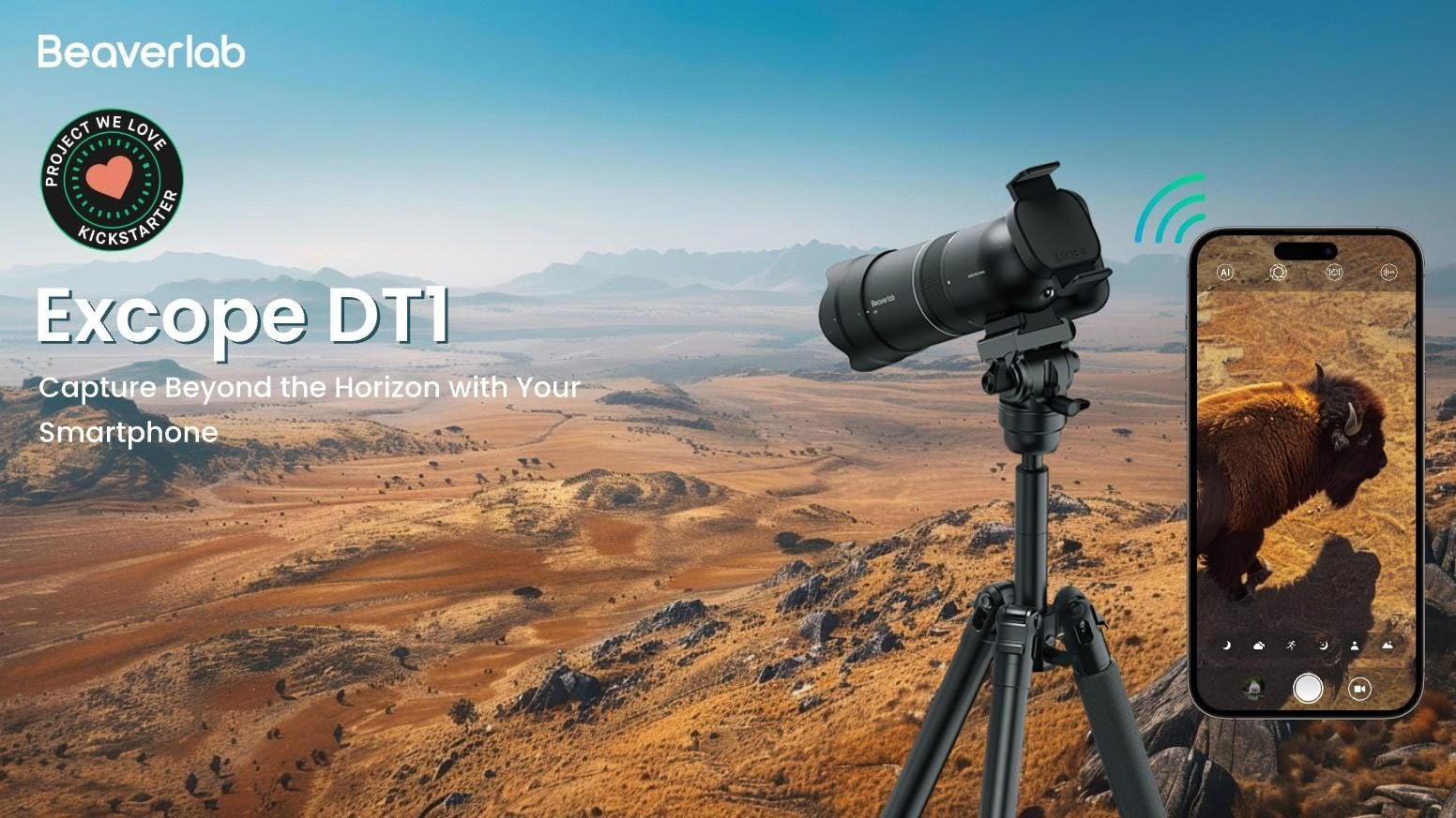
Take the example of Excope DT1: instead of just listing specs, TCF crafted a compelling narrative around Excope DT1’s origin, highlighting Jackson, the brand’s chief R&D engineer, struggling as a wildlife photographer seeking a better telephoto solution. This personal angle made the campaign relatable, while strategic storytelling across the page kept backers engaged. The result? Over $1.2 million raised.
Tip #42: Play It Smart—Set a Strategic, Realistic Goal
Your funding goal isn’t just about covering costs—it’s about creating momentum. Backers are far more likely to pledge when they see a campaign that looks successful early on. A goal that’s too high can stall your campaign, while a well-calculated, lower-but-realistic goal helps you:
Reach full funding faster, boosting confidence among potential backers.
Trigger Kickstarter and Indiegogo’s algorithms to promote your campaign.
Create social proof that makes your campaign feel like a must-back project.
That said, your goal still needs to make financial sense. Consider these key factors:
Prelaunch Lead Count – The number of engaged leads can help estimate early conversions. A well-prepped campaign should aim to cover at least 30% of the goal within the first 48 hours.
Product Pricing – Higher-priced products need fewer backers, while lower-cost products require a larger volume of pledges.
Production & Marketing Costs – Ensure your goal accounts for manufacturing, platform fees, shipping, and ad spend.
The trick is to set a goal that looks achievable yet ambitious. A campaign that crushes a $25K goal by hitting $250k looks far more attractive than one struggling to reach a $500K target. Keep your funding bar green, build excitement, and let the momentum work in your favor.
Tip #43: Craft Headlines & Subheadlines That Instantly Sell
Your headlines and subheadlines are the first things backers will read—make them count. They should immediately highlight your product’s biggest benefit or the core problem it solves. If your product is ultra-light, say so. If it’s the fastest, longest-lasting, or most innovative, that’s what needs to stand out.
For example, instead of a vague headline like “Revolutionary New Power Bank,” go for “Stay Powered for 7 Days—The Longest-Lasting Power Bank Ever.” Short, clear, and compelling headlines grab attention and make it obvious why your product is worth backing.
Your subheadline should reinforce this with more context. If the main benefit is extreme battery life, the subheadline can highlight supporting details like “50,000mAh capacity, charges 3 devices at once, and fits in your pocket.” Every word should serve a purpose—cut the fluff and focus on what matters most to your backers.
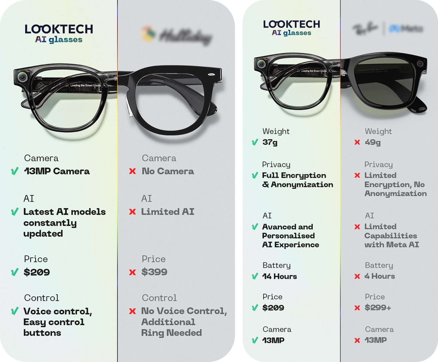
Tip #44: Use a Comparison Chart to Highlight Your Advantage
Backers don’t just want to know what your product does—they want to know how it stacks up against the competition. A well-structured comparison chart or a comparison table quickly communicates why your product is the superior choice, helping backers feel confident in their decision to pledge.
A cluttered page full of text won’t convert as well as a simple, easy-to-read chart that lays out the key advantages in a side-by-side comparison. Whether you’re competing against existing crowdfunding campaigns or mainstream brands, a strong comparison chart instantly positions your product as the best option.
How to Make a High-Impact Comparison Chart:
Focus on game-changing features – Don’t list minor details. Instead, highlight the factors that truly matter to backers: better performance, longer battery life, enhanced durability, or unique technology.
Use visual contrast – Make your product stand out with a different color or bold styling.
Keep it clean and scannable – A cluttered chart will confuse backers. Stick to a simple grid format with icons or checkmarks for quick readability.
Add credibility by being honest – If a competitor has a feature you don’t, acknowledge it. A completely one-sided chart can feel unrealistic and harm trust.
A well-designed comparison chart removes doubt, makes your product’s value undeniable, and gives backers a compelling reason to pledge.
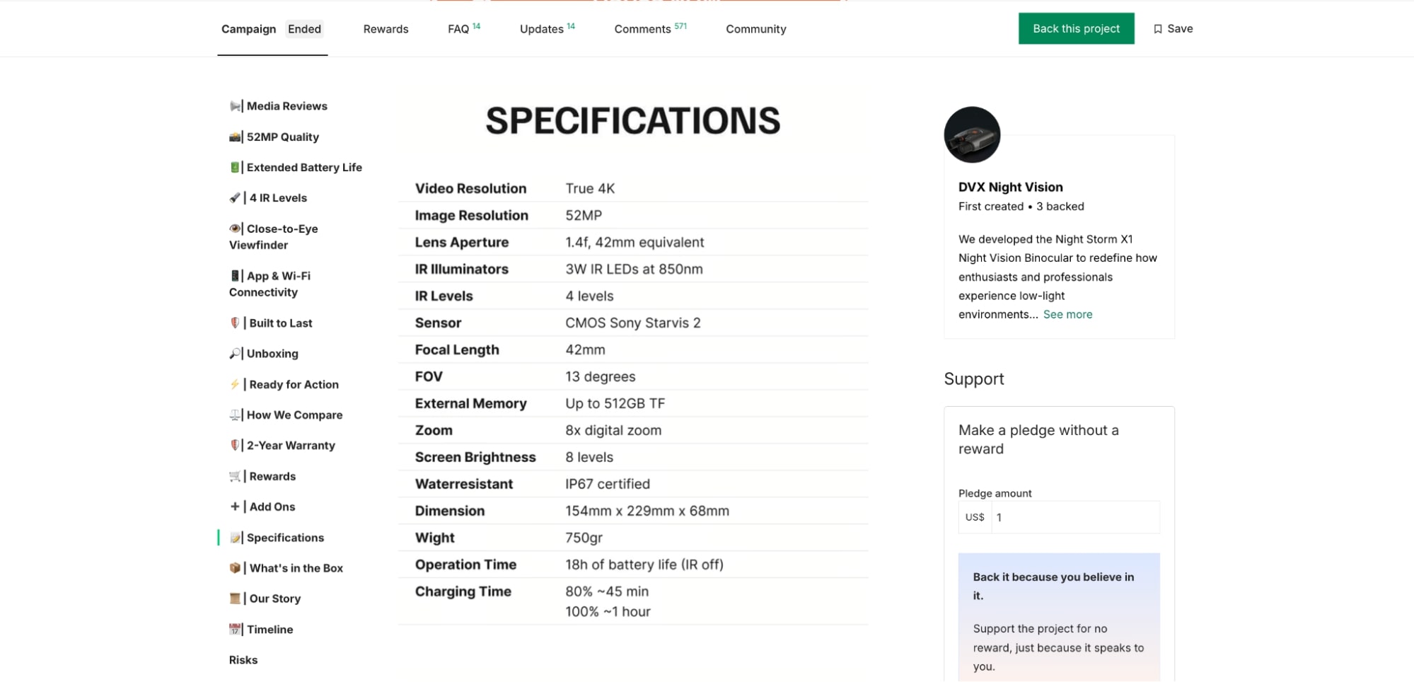
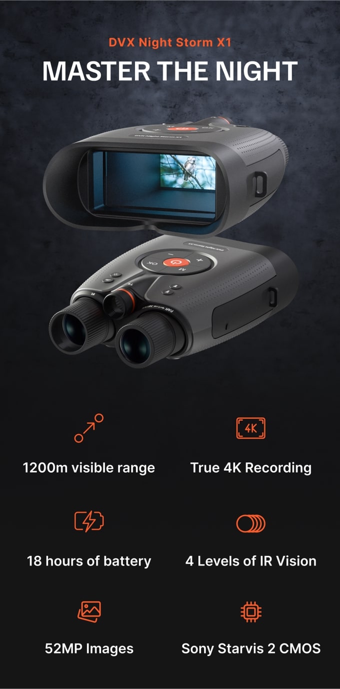
Tip #45: Add a Technical Specifications Chart for Clarity
While storytelling and benefits drive emotional engagement, some backers—especially tech enthusiasts—want hard data before making a decision. A technical specifications chart organizes all the key details in one place, making it easier for backers to see if the product meets their needs.
Instead of burying specs within long paragraphs, a structured chart keeps the page clean and ensures every detail is easy to find.
How to Make It Effective:
Include all essential details – Dimensions, weight, materials, battery life, processing power, connectivity options, and any other key specs.
Use metric and imperial units – Backers come from all over the world, so make sure measurements are accessible.
Keep it visually structured – A clean table format improves readability.
Place it strategically – Ideally, after showcasing the product’s main benefits but before FAQs.
For Night Storm X1, TCF structured the specs chart to highlight the most critical technical advantages, ensuring backers quickly saw why it outperformed competitors.
By using a well-organized specs chart, Night Storm X1 made it effortless for backers to compare features, reinforcing the product’s high-end positioning and helping drive conversions.
Tip #46. Strategically Position Your Rewards/Perks Section
Where you place your rewards on your campaign page can significantly impact conversions. For lower-priced products, you don’t need extensive persuasion—placing the rewards section higher on the page ensures backers can quickly see their options and pledge without hesitation.
For higher-ticket items, however, backers need more reassurance. In this case, introduce the rewards after thoroughly explaining the product’s benefits, features, and unique selling points. By the time they reach the rewards section, they’ll have a stronger understanding of the value they’re getting, making them more likely to commit.
Regardless of placement, ensure your perks are visually distinct and easy to navigate, so backers can make a decision without scrolling endlessly.
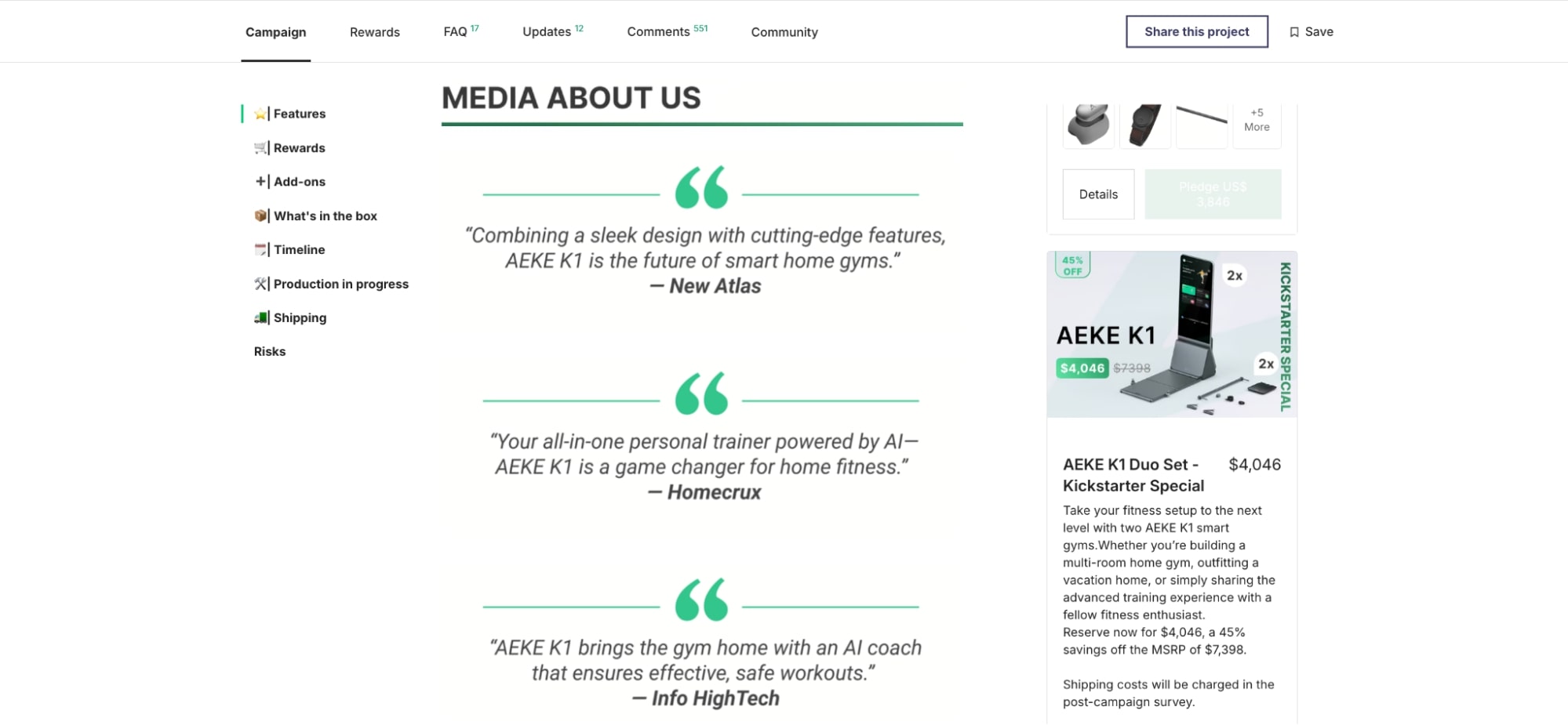
Tip #47: Highlight Media Mentions for Credibility
Media coverage from trusted sources adds instant credibility to a crowdfunding campaign. When backers see that reputable tech blogs and news sites are talking about your product, it reassures them that it’s not just another gadget—it’s worth their attention.
Simply listing media logos isn’t enough. Strong endorsements matter. A well-placed quote highlighting your product’s unique advantages is far more effective than a generic “featured in” section. If a publication praises your innovation or a reviewer calls it a “game-changer,” use that to reinforce your messaging.
How to Do It Right:
Feature high-authority media logos to establish credibility.
Include impactful quotes that highlight the most compelling aspects of your product.
Link to full articles for transparency and added trust.
Position media mentions strategically—ideally near the top of the page so backers see them right away.
A well-placed media section can be the deciding factor for hesitant backers, pushing them toward a pledge.
Tip #48: Use Customer Testimonials to Build Trust
If you’ve tested your product with real users—whether through a local test production, early adopters, or even a previous campaign—their feedback is invaluable. People trust other buyers more than marketing claims, so showcasing authentic testimonials can help backers feel more confident about pledging.
Just like media mentions, testimonials act as social proof, reinforcing credibility and showing that your product delivers on its promises. Choose testimonials that highlight key benefits and address common concerns, making it easier for potential backers to relate and make a decision.
Tip #49: Share Your Story and Team to Build Connection
Crowdfunding isn’t just about selling a product—it’s about bringing a vision to life with the support of backers who believe in it. Unlike traditional eCommerce, backers want to know who’s behind the idea.
Don’t hide behind a brand name or a sleek product page. Introduce yourself and your team. Share what inspired the product, the challenges you faced, and why you’re passionate about making it a reality. Including team photos or a founder’s note makes your campaign feel more personal, relatable, and trustworthy.
Whether you’re an industry expert or a first-time creator, putting a face to the project creates a stronger emotional connection with potential backers—one that can turn interest into real support.
Tip #50: Offer Guarantees & Provide Clear Shipping Costs
Backers want confidence that your product will be delivered as promised, and unexpected costs can quickly turn them away. That’s why offering guarantees and a transparent shipping table can significantly increase conversions.
A satisfaction guarantee—such as a 1-3 month return policy—reduces the perceived risk and reassures backers that they’re making a safe investment. A guaranteed delivery badge also builds trust by showing that if the product isn’t shipped, backers will get their money back.
Alongside guarantees, a detailed shipping table helps prevent hesitation at checkout. List costs by region, estimated delivery times, and any important details like VAT or customs fees. If free shipping is available, highlight it as an incentive.
Transparency in both guarantees and shipping minimizes uncertainty, builds credibility, and increases conversion rates.
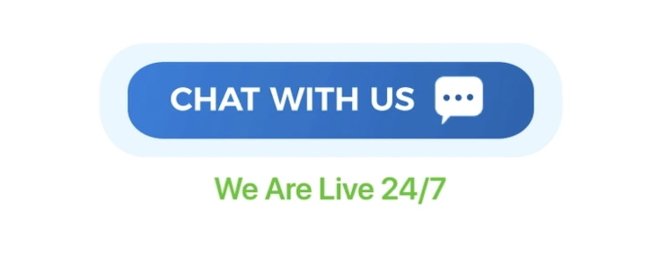
Tip #51. Add 3-4 ‘Chat with Us’ Buttons for Instant Support
Direct communication builds trust, and adding strategically placed Chat with Us buttons throughout your campaign page makes it easy for backers to reach out with questions. These buttons provide real-time support, address hesitations, and increase conversions by giving visitors the confidence to pledge.
For best results, position them:
Near the top of the page for immediate visibility
In the rewards section, where backers might have last-minute questions
Towards the bottom, ensuring support is available after reading through product details
Connecting your button to Messenger or another live chat tool ensures backers get quick, direct responses, reducing friction in the decision-making process.
Tip #52. Use Interactive CTA Buttons to Boost Engagement
A strong call-to-action (CTA) isn’t just about telling people what to do—it’s about making it irresistible for them to take action. Adding interactive elements to your CTA buttons, like subtle animations or a slight movement effect, can increase engagement by making them feel more dynamic and urgent.
For instance, a CTA that fills up like a progress bar or displays a countdown for a limited-time offer can create a sense of urgency. A chat button that says “We’re live—ask us anything!” can encourage hesitant backers to reach out before making a decision.
The goal is to make taking action feel natural and rewarding. Whether it’s signing up, reserving a spot, or claiming a discount, your CTA should make it clear why clicking now is the best choice.
Tip #53: Set Up Tracking to Optimize Your Campaign Performance
Tracking your campaign’s performance is essential for maximizing conversions and optimizing marketing efforts. Without proper analytics in place, you’re flying blind, missing out on key insights that could help you refine your messaging, improve your page, and increase backer engagement.
Start by integrating Google Analytics on your campaign page. This tool allows you to track important metrics like traffic sources, bounce rates, time on page, and conversion rates. You’ll be able to see which marketing channels are driving the most pledges and which sections of your campaign page are keeping visitors engaged. Both Kickstarter and Indiegogo support Google Analytics, making it a must-have for any serious campaign.
For Indiegogo campaigns, take it a step further by setting up Meta Pixel (formerly Facebook Pixel). This tool enables you to:
Track user actions: See who visits your campaign page, watches your videos, or clicks on reward tiers.
Optimize ad performance: Improve your paid campaigns by targeting users most likely to convert.
Retarget potential backers: Run dynamic retargeting ads to re-engage visitors who viewed your campaign but didn’t pledge.
If you’re running email marketing or paid ads, use UTM parameters on all links leading to your campaign page. This will help you differentiate between traffic sources—whether from influencer collaborations, social media ads, or newsletters—and see which ones drive the most backers.
Setting up tracking before launch ensures you gather insights from day one, allowing you to fine-tune your strategy in real time. Whether it’s adjusting your ad spend, refining your messaging, or tweaking your landing page, having data-driven insights will help you make the right moves to boost conversions.
Tip #54: Create Urgency to Drive Conversions
Crowdfunding success depends on momentum, and creating a sense of urgency encourages backers to pledge sooner rather than later. If people feel they have unlimited time to decide, they’re more likely to hesitate—or worse, forget entirely. Strategic urgency tactics push them to act now.
Here’s how to do it effectively:
Exclusive Early Gifts: Offer a limited-time bonus for backers who pledge within the first 24 hours. A countdown timer reinforces the urgency.
Limited Early Bird Spots: Tiered early-bird pricing with only a set number of spots available encourages people to lock in the best deal before it’s gone.
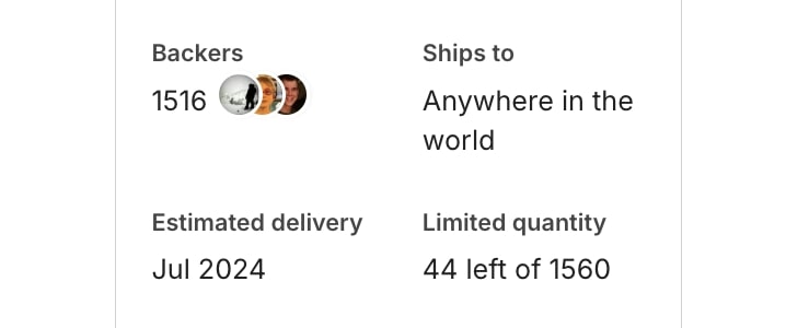
Scarcity-Driven Availability: Display “X units left” for exclusive rewards, making backers feel they might miss out if they wait.
Limited Early Shipping Slots: Offer priority shipping for the first batch of backers—this works particularly well for tech and gadget campaigns.
Using these tactics ensures your campaign gains traction quickly, boosting visibility on Kickstarter or Indiegogo’s platform and triggering the algorithm to feature your project more prominently. The faster you fund, the more people will want in.
Tip #55: Boost Pledges with Accessories & Upsells
Maximizing your crowdfunding revenue isn’t just about selling your main product—it’s also about offering smart upsells that increase average pledge value. Instead of a one-size-fits-all approach, structure your rewards with three key tiers:
Base Tier – The core product at the standard price.
Bundles – Higher-value packages that include add-ons or multiple units at a discounted rate.
Accessory Upsells – Offer complementary items like cases, chargers, or exclusive add-ons that enhance the main product’s functionality.
For Indiegogo campaigns, use the Secret Perk feature to give VIP backers an exclusive discount or bundle, making them feel valued while driving early conversions. These exclusive perks can be shared via email or community updates, encouraging early supporters to pledge fast before the offer disappears.
This tiered strategy not only increases funding but also keeps backers engaged, making them more likely to upgrade their pledge and share the campaign with others.
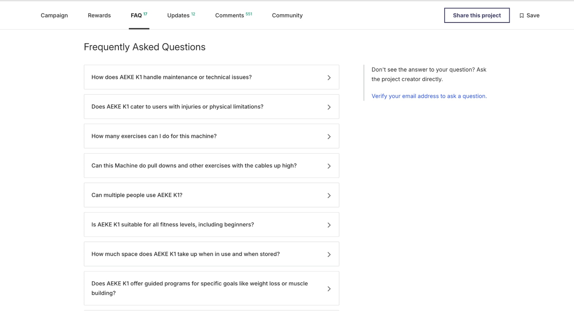
Tip #56: End Your Page with a Strong FAQ Section
A well-structured FAQ section at the bottom of your campaign page can reduce hesitation and increase conversions. Backers often have last-minute questions before pledging, and providing clear answers upfront minimizes doubts and unnecessary support inquiries.
Here’s what to cover in your FAQ:
Product Details – How does it work? What makes it different?
Shipping & Delivery – When will backers receive their rewards? Which countries do you ship to?
Perks & Rewards – What’s included in each perk? Can backers upgrade their pledge later?
Refunds & Guarantees – What if the product doesn’t meet expectations?
Campaign Timeline – What are the key milestones from funding to production to delivery?
By addressing common concerns before backers even have to ask, you build trust, streamline the decision-making process, and reduce friction at checkout.
Design Elements
People process visuals faster than text, so your campaign’s design needs to work at a glance. A well-crafted, visually appealing page directly impacts conversions. Every image, layout choice, and design element should guide backers through your story, highlight key product benefits, and make pledging feel effortless.
Tip #57. Optimize Your Page for Mobile-First Viewing
The majority of crowdfunding traffic comes from mobile users, so your campaign page must be designed with a mobile-first approach. A poorly optimized page—where text is hard to read, buttons are difficult to tap, or images don’t load properly—can lead to frustrated visitors who leave without backing your project.
Before finalizing your page:
Test it on different screen sizes to check for readability, image alignment, and navigation flow.
Adjust fonts and spacing to ensure headlines are clear and body text is easy to skim.
Keep CTA buttons large enough to tap effortlessly.
Avoid placing essential elements too close together.
If your page includes GIFs or videos, make sure they load quickly and don’t slow down performance.
A smooth, mobile-friendly experience increases engagement, keeps visitors on your page longer, and ultimately boosts conversion rates.
Tip #58: Make Your Thumbnail Instantly Recognizable
Your campaign thumbnail is the first thing potential backers see—on Kickstarter, Indiegogo, social media, and even Google search results. If it’s unclear or unremarkable, you risk losing attention before people even click.
To make your thumbnail work:
Clearly showcase the product—avoid clutter, small text, or overly complex visuals.
Use compelling text that highlights a key benefit or unique feature. A short, punchy phrase can make all the difference.
Leverage recognizable logos if your product has been featured in top media or has a strong brand association.
A great thumbnail acts like a mini billboard for your campaign. Make it count.
Tip #59: Use High-Quality Visuals That Tell the Story
Your campaign page should sell your product at a glance, and that starts with high-quality visuals. Every image should be sharp, well-lit, and thoughtfully composed to make your product look as good as it deserves. But it’s not just about aesthetics—your visuals should also communicate function and value.
Backers should be able to understand what your product does just by looking at it. Show key features, highlight its unique advantages, and use lifestyle shots to help people visualize it in their own lives.
And don’t underestimate the power of the first image on your page—it sets the tone for your entire campaign. Make it clear, compelling, and impossible to ignore.
Tip #60: Use GIFs Strategically to Enhance Engagement
Short, well-placed GIFs can bring your product to life, making it easier for backers to grasp key features in seconds. They add movement, demonstrate functionality, and keep the page dynamic—but moderation is key.
If you’re showcasing build quality or fine details (like in luxury watches or high-end materials), stick to high-resolution close-ups instead. A crisp, detailed image will always do a better job of emphasizing craftsmanship than a compressed GIF.
For everything else—folding mechanisms, quick demos, or interactive elements—GIFs are a great way to keep your page engaging without overwhelming it. Just keep them short (under 2MB) to ensure fast loading times.
Tip #61: Keep It Short, Impactful, and Visual
Backers don’t want to wade through walls of text to understand your product. They want quick, clear takeaways—and they want them fast.
Make every word count. Use concise, benefit-driven headlines and let your visuals do most of the talking. If a feature needs explaining, show it rather through images, GIFs, or short demos.
A well-structured page flows naturally, guiding visitors from one key point to the next without overwhelming them. The less effort it takes to understand your product, the more likely backers are to pledge.
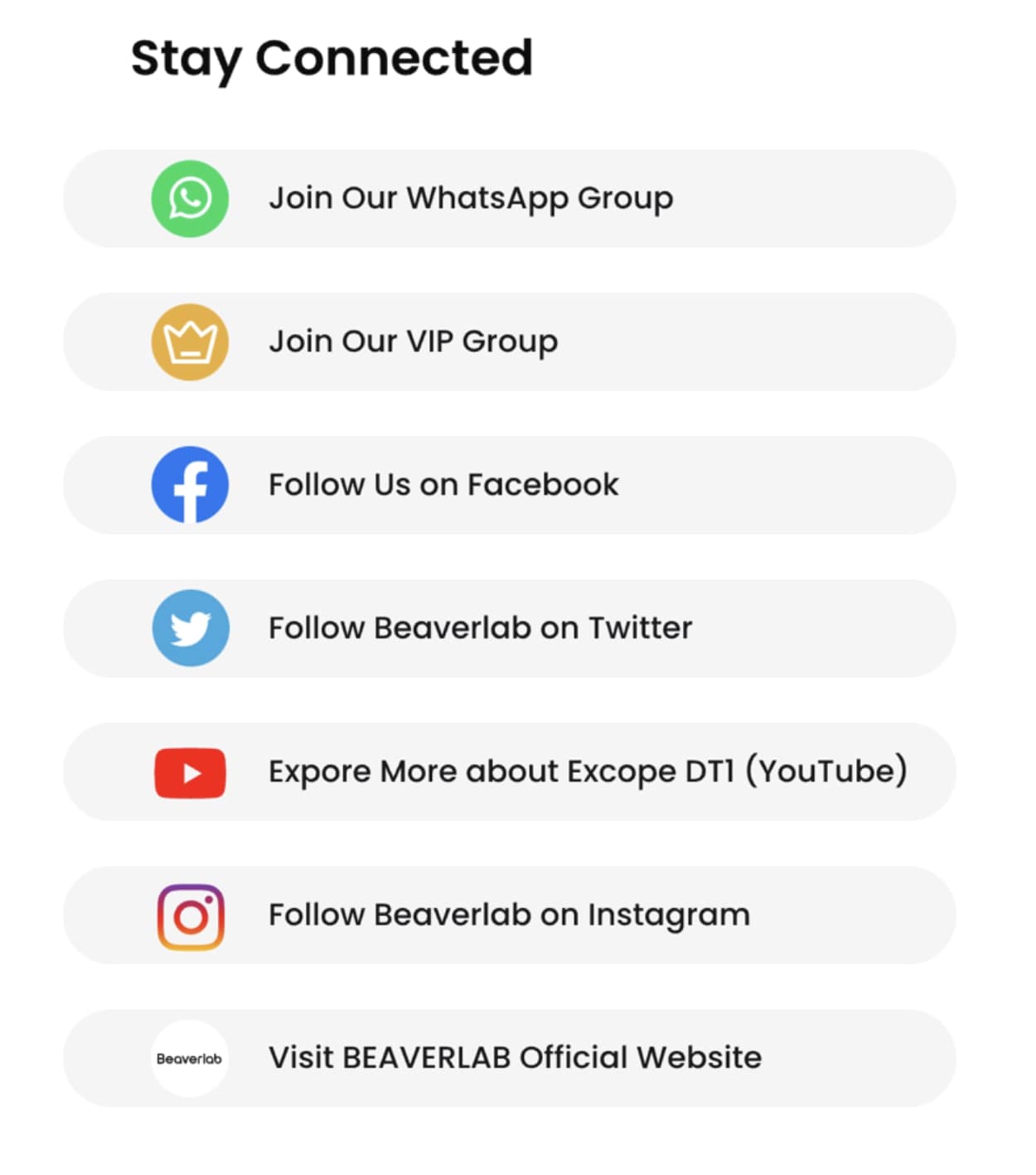
Tip #62: Use Follow Buttons to Build Long-Term Engagement
Instead of cluttering your page with share buttons that rarely drive traffic, focus on what actually builds momentum—followers.
A “Follow” button linking to your Instagram, Facebook, or TikTok ensures backers stay engaged beyond the campaign. This not only boosts trust (a brand with an active community feels more legit) but also keeps potential buyers in your ecosystem for future launches, updates, and post-campaign sales.
Rather than hoping backers will promote your campaign for you, make it easy for them to stay connected—so they’re there when you need them.
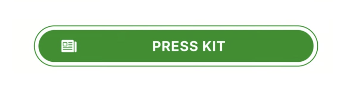
Tip #63: Make Your Press Kit Instantly Accessible
Journalists don’t have time to dig through your page for media assets. A dedicated Press Kit button ensures they can quickly find everything they need—product images, key features, founder bios, and past media mentions—all in one place.
Rather than creating a separate media section on your page, keep it simple with a clickable Press Kit button. Want to make it even faster? Add a QR code so journalists can access it instantly, whether they’re on desktop or mobile.
The easier you make it for the media to cover your campaign, the more likely they will.
Tip #64: Keep Your Page Design Consistent
A visually cohesive page helps backers process information faster and makes your campaign feel more polished and professional.
If you’ve chosen a specific style for titles, subheadings, and key sections—whether it’s uppercase headers, underlined text, or a unique font style—stick to it throughout the page. This consistency creates a natural flow and makes your content easier to scan.
Beyond typography, maintain a unified color scheme, icon style, and visual structure. If you introduce a playful design element (like thought bubbles or interactive graphics), keep it consistent so it reinforces your campaign’s messaging rather than distracting from it.
A well-structured, visually harmonious page doesn’t just look better—it builds trust and keeps backers engaged.
Perks and rewards are more than just a thank-you gift for backers—they’re a strategic tool to drive funding, create urgency, and increase your campaign’s overall success. But setting them up correctly requires more than just slapping a discount on your product.
How much should you offer? What’s the best way to maximize conversions? How can you create a sense of urgency without overcomplicating things?
We’ve broken it all down with proven strategies to help you make the most of your perks and rewards.
Tip #65. Keep the Quantities Low
Scarcity sells. When backers see a limited number of rewards available, they’re more likely to act fast. Offering a small quantity of perks—especially early-bird deals—creates a sense of urgency and drives conversions.
Instead of making hundreds of units available from the start, cap the number of discounted tiers. As each batch sells out, introduce the next one at a slightly higher price. This not only maintains demand but also keeps momentum going throughout your campaign.
Tip #66. Don’t Offer Too Much at Once
Too many choices can backfire. When backers are presented with too many options, they hesitate, overthink, and sometimes leave without making a pledge. Instead of overwhelming them with a dozen different reward tiers, simplify your offerings at launch.
Start with a core set of perks—ones that highlight the best value and appeal to the widest audience. Then, introduce additional options strategically:
Stretch Goals – Unlock new rewards as funding milestones are hit, giving backers a reason to stay engaged.
Exclusive Add-Ons – Keep your main perks simple but offer extras (accessories, upgrades) in the pledge manager.
This structured approach ensures backers feel confident in their choices while keeping excitement high throughout the campaign.
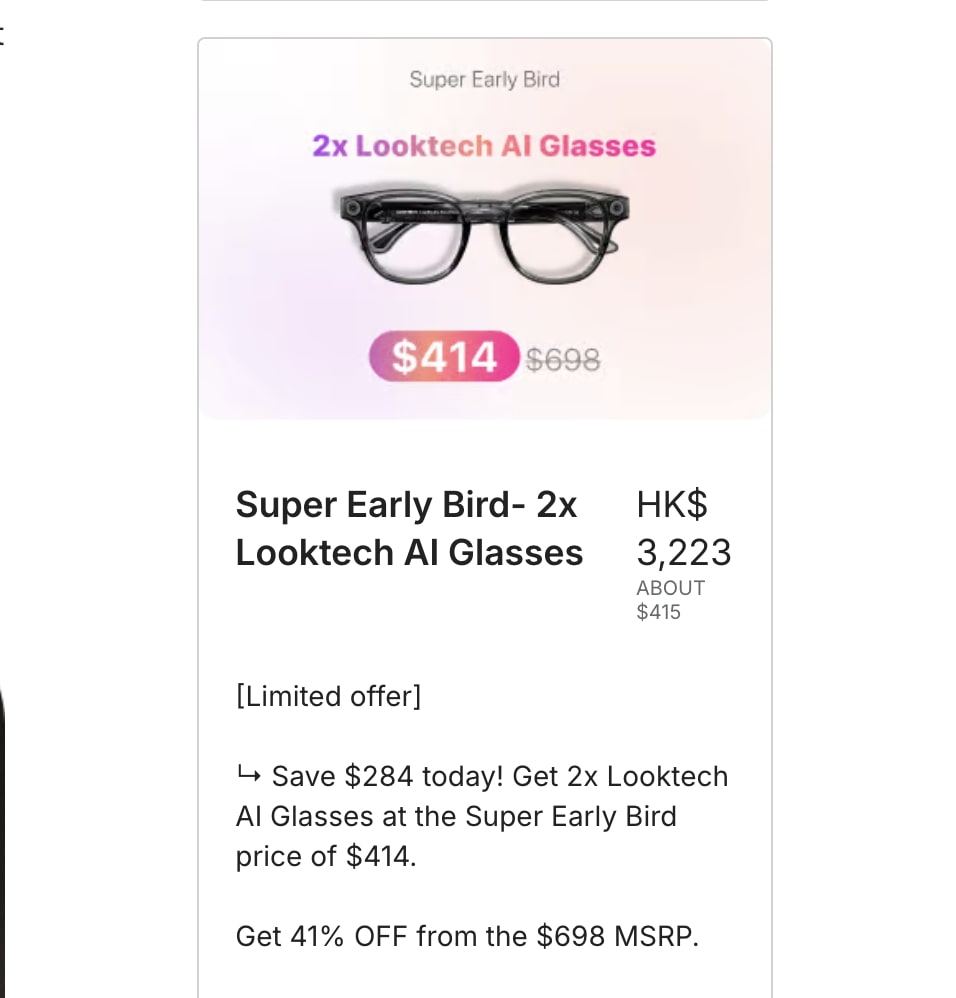
Tip #67. Make Your Indiegogo Perks Visually Clear and Informative
Perks on Indiegogo should be as visually self-explanatory as possible. Since Indiegogo discourages displaying prices and detailed text in the perks section, your images need to do the heavy lifting.
Use Visual Quantity Indicators – Instead of writing “2x,” show two of the products in the image so backers instantly understand what they’re getting.
Highlight Key Inclusions – If the perk includes accessories, variations, or exclusive items, make them visible in the image rather than relying on text.
Clarify Shipping Info – If your perk is limited to certain regions, ensure that information is clearly noted below the image to prevent confusion.
Keep It Clean and Easy to Scan – Avoid cluttered visuals or excessive design elements. The perks section should be digestible at a glance.
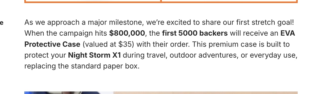
Tip #68: Leverage Stretch Goals to Keep Momentum Going
Hitting your funding goal is just the start—stretch goals give backers a reason to keep pledging and create excitement around your campaign. When done right, they help maintain momentum, attract new supporters, and increase your total funding.
How to Set Effective Stretch Goals:
Start with achievable milestones – Set realistic funding increments to keep backers engaged without making the next goal feel out of reach.
Offer valuable rewards – Prioritize upgrades that genuinely enhance the product, like extra features, exclusive colors, or premium materials. Avoid unnecessary add-ons that don’t add real value.
Announce them strategically – Don’t reveal all stretch goals at once. Unveil them as you hit milestones to maintain excitement and engagement throughout the campaign.
Show progress visually – A stretch goal tracker (like a progress bar or graphic) makes it easy for backers to see what’s coming next and motivates them to share the campaign to help unlock the next reward.
A strong stretch goal strategy doesn’t just bring in more funding—it builds hype, strengthens community engagement, and keeps the energy high all the way to the finish line.
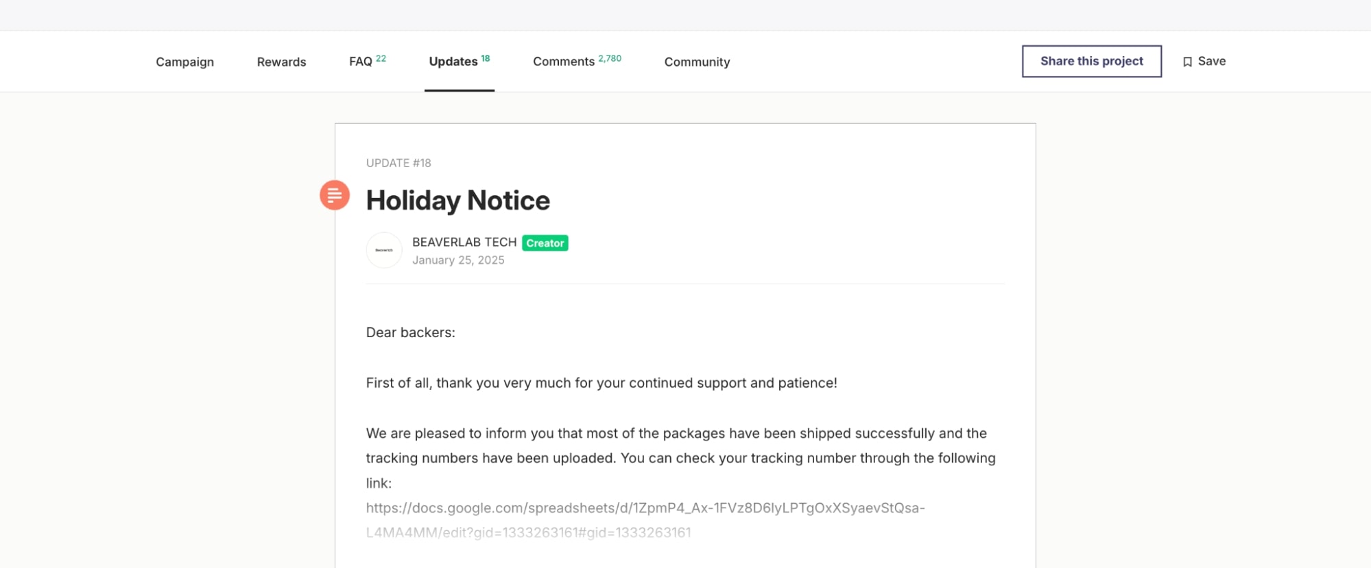
Tip #69: Keep Backers Engaged with Regular Updates
Transparent communication is key to a successful crowdfunding campaign. Regular updates not only keep backers informed but also build trust, reduce refund requests, and maintain engagement throughout the campaign.
What to Include in Your Updates:
Milestone Announcements – Celebrate key achievements like hitting funding goals, unlocking stretch goals, or reaching a certain number of backers.
Production & Shipping Updates – Keep backers in the loop about manufacturing progress, expected delivery timelines, and any potential delays. Transparency reduces frustration and prevents refund requests.
Reviews & Early Feedback – Share testimonials from beta testers, influencers, or media reviews to reinforce confidence in your product.
Behind-the-Scenes Content – Show the process of bringing the product to life, from design tweaks to production insights. This makes backers feel more involved in the journey.
Exclusive Perks & Surprises – Introduce surprise bonuses or add-ons for engaged backers to keep excitement levels high.
The more informed and involved backers feel, the more likely they are to support your campaign, share it with others, and stick around for future launches.
Make Your Project The Next 7-Digit Crowdfunding Campaign
This was the third and final part of our crowdfunding series, where we broke down everything you need to build a high-converting Kickstarter or Indiegogo campaign page.
In the first two parts, we laid the groundwork. We started with idea validation and research, ensuring your product has demand, analyzing competitors, and setting realistic goals. Then, we moved on to prelaunch strategies, focusing on building an engaged audience, creating a waitlist, and generating momentum so your campaign kicks off strong.
Now, in this final part, we’ve taken it a step further by breaking down the campaign page itself—the place where all your hard work pays off. We covered everything from crafting a compelling story and structuring rewards to using high-impact visuals, social proof, and trust signals to boost conversions. A strong campaign page isn’t just about looking good—it’s about guiding backers through a seamless journey that convinces them to pledge.
From comparison charts and shipping transparency to urgency tactics and strategic perks, every element plays a role in turning visitors into supporters. And with the right tracking, updates, and engagement strategies, you can keep backers invested beyond the initial pledge.
With all three parts combined, you now have the full playbook to go from idea to fully funded campaign.
The only thing left?
Taking action and launching your campaign with confidence.
The end.
Jasmine Khachatryan
With over five years of focused expertise in influencer marketing, Jasmine brings creativity, sharp strategic insight, and a proven track record to every project. Jasmine’s writing is an extension of her professional skill set, transforming complex topics into accessible, engaging content that informs and captivates readers. Her articles not only inform but entertain, transforming dry subjects into lively reads. This unique approach ensures that every piece is both insightful and enjoyable, leaving readers with valuable takeaways and a smile.
Comments
Leave a Reply
Crowdfunding Trends in 2025: Top Products That Will Dominate the Market


Comments