Discover the Insider Secrets of Million-Dollar Crowdfunding Campaigns
Some clients pay us over $1,000,000 to run their
multi-million-dollar crowdfunding campaigns. For the first time ever, we’re pulling back the
curtains and showing you how we do it.
How to develop a product everybody wants
How to get 100,000 visitors to your page
How to increase sales by over 37%
What services to use... and which ones you shouldn’t waste time on
You’ve spent time, money, and brainpower driving traffic to your store — but if your product pages aren’t pulling their weight, you’re basically pouring water into a leaky bucket.
Product page optimization is often the silent hero behind strong sales numbers. A beautiful page that doesn’t convert? Useless. A simple one that does? Golden.
The good news? You don’t need a complete overhaul to make your product pages work harder. With the right tweaks — from visuals and copy to trust signals and tracking — you can dramatically increase conversions without reinventing the wheel.
In this guide, we’ll break down:
what product page optimization actually means,
the elements that move the needle,
how to track your progress,
and real-world examples you can learn from.
Let’s turn those product pages into high-converting machines.
What Is Product Page Optimization?
Product page optimization is the process of fine-tuning your product detail pages to increase conversions. That means making it easier — and more compelling — for visitors to go from just browsing to actually buying.
But it’s not just about having a pretty layout or clever copy. It’s about creating an experience that removes friction, builds trust, and answers every question a shopper might have — often before they even think to ask.
That includes everything from how quickly your page loads, to how persuasive your descriptions are, to how your “Add to Cart” button makes someone feel. When done right, optimization makes buying feel effortless — and that’s exactly what turns casual visitors into loyal customers.
Key Elements of a High-Converting Product Page
A product page has one job: to help shoppers make a confident buying decision. That means more than just showing what the product looks like or listing out its features. It’s about creating an experience that answers questions, builds trust, and makes the next step feel easy.
Here are the elements that consistently make the biggest difference:
1. Above-the-Fold Essentials
The top of your product page should give shoppers everything they need to stay engaged — no scrolling required. Keep it clean, uncluttered, and mobile-friendly.
Product title
Price
Variant selector
CTA button (clear, high-contrast)
Thumbnail images
Tip: Use a sticky CTA on mobile to keep the “Add to Cart” button in view as shoppers explore the page.
2. Conversion-Focused Product Photography
Great visuals do more than show off your product — they help shoppers imagine owning it.
High-resolution images
Multiple angles
Zoom functionality
Lifestyle photos
Product-in-use shots or unboxing videos
Use visuals that answer common questions: How big is it? What’s the texture? Will it fit my space or style?
Tip: If your product comes in variants, update the main image automatically when a shopper selects a new option. It reduces confusion and drop-off.
3. Benefit-Driven Product Descriptions
Your copy should show how the product fits into the shopper’s life. Focus on outcomes, not just specs.
Start with the main benefit
Use short, easy-to-scan paragraphs
Support with bullet points for quick takeaways
Address common questions and concerns upfront
Every line should answer the question: “Why should I buy this?”
Tip: Use a simple formula — Feature → Benefit → Result — to turn technical details into persuasive copy.
4. Clear and Compelling CTAs
Your call-to-action should be impossible to miss — and easy to say yes to.
Use action-first language (“Add to Bag,” “Get Yours”)
Make it visually distinct from the rest of the page
Keep it above the fold — and repeat after key content
Size it for mobile and desktop
Test colors, copy, and placement regularly
Your CTA should feel like the natural next step — not a hard sell.
Tip: Run a quick “squint test” — if you blur your eyes and the CTA doesn’t stand out, something needs adjusting.
5. Variant Selection Support
If your product comes in different sizes, shades, colors, or formats, choosing the right one should feel effortless.
Use size guides, shade finders, or product comparison charts
Add quick notes like “Best for dry skin,” “Runs small,” or “Fits iPhone 14 only”
Let the main image update automatically when a variant is selected
Call out compatibility clearly — especially for tech, accessories, or refill-based products
Tip: Highlight your most popular option with a tag like “Top Pick” or “Most Chosen.” It removes doubt and adds a layer of social proof.
6. Trust Signals That Reduce Hesitation
Before they click “Buy,” shoppers want to feel confident.
Star ratings and written reviews
User-generated content (UGC)
Expert quotes or press mentions
Return and refund policies
Secure checkout badges
Don’t bury these at the bottom — bring them closer to the action, especially near your CTA.
Tip: Featuring a few lower-rated reviews (with thoughtful replies) can boost credibility more than a wall of perfect 5-stars.
7. On-Page Support Options
When shoppers have questions, they shouldn’t have to leave the product page to get answers. Support should be easy to access and built into the experience.
Add live chat or chatbot widgets
Include a clear, collapsible FAQ section
Offer an “Ask a Question” or “Need help?” prompt near the CTA
Surface relevant help articles or shipping info dynamically
Ensure support is mobile-friendly and doesn’t interrupt browsing
Tip: Use chat tools that trigger based on behavior — like time on page or scroll depth — to offer help before the shopper gets stuck.
8. Consistent Branding and Visual Hierarchy
Your product page should feel like an extension of your brand — not a generic template.
Use brand colors, fonts, and tone of voice
Stick to a clear visual hierarchy (headings, subheadings, CTA)
Align product images with your brand’s overall aesthetic
Keep formatting clean and easy to scan
Avoid mismatched visuals or inconsistent messaging
Every element should feel intentional — like it belongs to the same story.
Tip: Reuse branded design components from your homepage or landing pages to reinforce familiarity and flow.
9. Fast, Mobile-Optimized Performance
No matter how good your page looks, if it loads slowly or breaks on mobile, you’re losing sales.
Aim for load times under 3 seconds
Use compressed, next-gen image formats (like WebP)
Enable lazy loading for media-heavy pages
Avoid popups that interrupt the experience
Prioritize mobile-first layout and testing
Performance isn’t just a technical detail — it’s a conversion factor.
Tip: Run regular audits with tools like PageSpeed Insights or Shopify’s analyzer to catch slowdowns before they impact revenue.
10. SEO That Brings in the Right Traffic
Product page optimization starts with visibility. If shoppers can’t find your page, they’ll never convert — no matter how good it looks.
Use clear, keyword-rich product titles
Write unique meta titles and descriptions for every product
Optimize URLs (short, readable, and relevant)
Add alt text to all images
Avoid duplicate content from suppliers
Tip: Use your most important keywords naturally in the first 100 words of your product description for better crawlability and relevance.
11. Buying Options That Remove Friction
The checkout experience starts on the product page. The more flexible and reassuring your buying options are, the easier it is for shoppers to commit.
Show real-time inventory or availability
Offer multiple payment methods (Shop Pay, Apple Pay, PayPal, etc.)
Include installment options like Afterpay or Klarna
Display estimated delivery dates clearly
Make return and refund policies easy to access
Clarity and flexibility at this stage can be the final push toward conversion.
Tip: Position payment and shipping options near the CTA to reduce last-minute doubts and build trust.
12. Related & Complementary Products
Smart recommendations can increase average order value and improve the shopping experience.
Show related items based on category or use case
Recommend complementary products (e.g. charger with phone, brush with makeup)
Place suggestions near the CTA or after reviews
Avoid overwhelming shoppers with too many options
Besides helping shoppers discover more, this kind of internal linking sends helpful signals to search engines and encourages deeper site exploration, improving SEO and reducing bounce rates.
Tip: Label recommendations with intent-driven cues like “Complete the Look” or “Pairs Well With” to make them feel curated, not random.
13. Mobile-Specific Optimizations
Your mobile experience isn’t just a scaled-down version of desktop — it’s often where the majority of purchases happen. That means it needs to be smooth, fast, and thumb-friendly.
Prioritize a mobile-first layout with large tap targets
Test on multiple devices and screen sizes. A beautiful desktop page means nothing if it breaks on mobile.
Tip: Use analytics to see which devices your audience actually uses — and optimize for them first.
14. Structured Data That Helps You Stand Out in Search
Structured data is a bit of behind-the-scenes code that helps Google understand what’s on your page — like your product’s name, price, availability, star rating, and more. When done right, it can trigger rich results: those enhanced listings in search that show extra info like images, reviews, and pricing.
What to mark up:
Product title, brand, SKU
Price and availability
Reviews and aggregate rating
Delivery or return policy info (when possible)
Tip: Most ecommerce platforms (like Shopify or WooCommerce) handle this automatically or offer apps/plugins that do. Just make sure it’s implemented correctly by testing with Google’s Rich Results Test.
15. A/B Testing for Continuous Improvement
Even small changes to your product page can have a big impact — but you won’t know what’s working unless you test.
Test variations of headlines, CTA copy, image order, or layout
Run experiments long enough to reach statistical significance
Focus on one change at a time for clean results
Tip: Tools like Google Optimize, VWO, or Convert are great for setting up split tests — or you can use built-in tools in Shopify Plus.
How to Measure If Your Product Page Is Actually Working
Once your product page is live, design takes a back seat to performance. And while there’s no shortage of data to track, only a handful of metrics truly tell you if your page is doing its job.
Forget vanity numbers. Focus on the signals that show real buyer intent and highlight where shoppers are getting stuck — or sailing smoothly through to checkout.
1. Conversion Signals: Are People Taking Action?
This is where performance becomes measurable. If your product page is working, visitors aren’t just browsing — they’re taking steps toward buying. These metrics help you quantify intent.
Conversion rate shows what percentage of visitors complete a purchase. It’s the clearest sign of whether your page is working. If it’s low, something’s likely off — the offer, messaging, or trust signals. For most ecommerce stores, 2–3% is a solid starting benchmark.
Add-to-cart rate measures how many visitors are interested enough to start the buying process. A high rate means your page is persuasive; a low one suggests issues with product clarity or perceived value. If this number is strong but conversions are low, the problem likely lies beyond the product page.
2. Engagement Quality: Are People Paying Attention?
Conversions are the goal, but engagement shows you why people are buying — or not. These metrics reveal how visitors interact with your content and where their attention drops off.
Time on page tells you how long visitors are staying. Low time usually means the page didn’t capture interest. Very high time without action might suggest confusion or too much friction. Or it may mean shoppers are overanalyzing because your product description isn’t giving them enough to confidently decide.
Click and scroll behavior helps you see what’s working visually. Are people interacting with images, reviews, or variant selectors? Tools like Hotjar or Microsoft Clarity can highlight what’s drawing attention — and what’s getting ignored.
Click-throughs on CTAs show whether your page is generating intent. Even small tweaks — like changing button text or moving it higher — can lift performance.
3. Experience Friction: Are You Losing People Too Soon?
If shoppers are engaging but not converting, it’s time to look at what might be getting in their way. These metrics highlight where the experience breaks down — whether it’s a slow load, poor layout, or misaligned expectations.
Bounce rate shows how many visitors leave without interacting. A high bounce rate usually means the page didn’t deliver what they expected — or it took too long to load, especially on mobile.
Return rate reflects whether the product matched what the page promised. High returns can kill profitability — and often point to fixable issues like misleading visuals, vague descriptions, or confusing variant options.
4. Bigger Picture: Are You Driving Quality Traffic?
Even the best product page won’t convert if the wrong people are landing on it. These metrics help you assess the quality of your traffic — and how well your page is performing in search.
Organic visibility shows where your product ranks and how often it appears in search. If impressions are high but traffic is low, your title or meta description might need work.
Click-through rate (CTR) from search tells you if people are compelled to click. A strong product page starts by earning that click — not just waiting for it.
Track these consistently, and they’ll point you to what needs fixing — and what’s already working.
Product Page Examples That Get It Right
Now that we’ve broken down what makes a product page convert — and how to measure it — let’s look at real-world examples that bring those principles to life. These brands aren’t just checking boxes; they’re using layout, copy, imagery, and strategy to create shopping experiences that work.
Here are a few standout product pages — and what you can learn from each one:
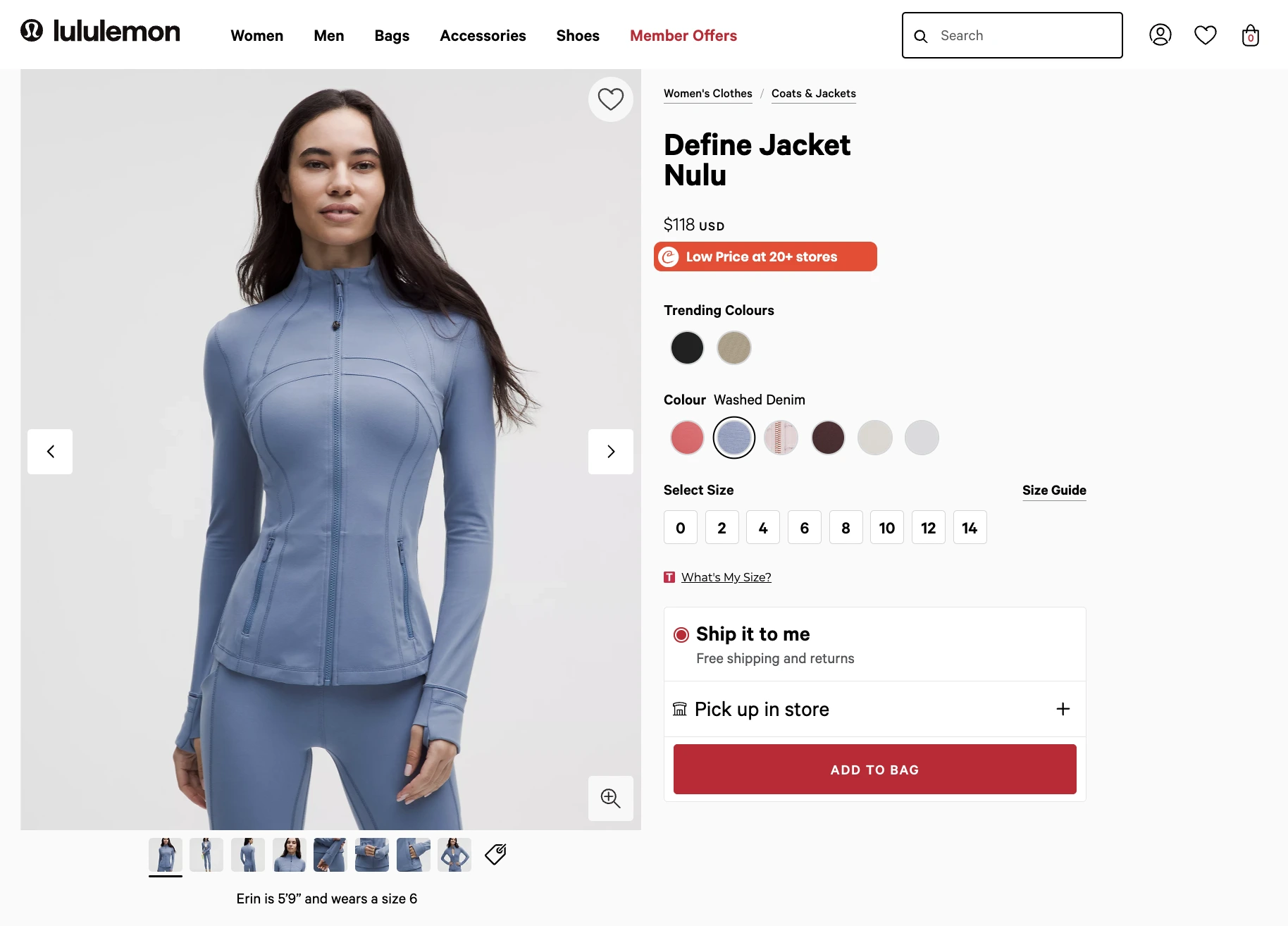
Lululemon’s Define Jacket page nails the essentials: clean visuals, clear sizing, mobile-friendly UX, and persuasive copy. With strong reviews, fit guidance, and feature highlights, it removes friction and makes buying feel easy and confident.
Takeaway: For apparel, pair sleek visuals with detailed fit info and reviews. The smoother the sizing experience, the more confident the customer.
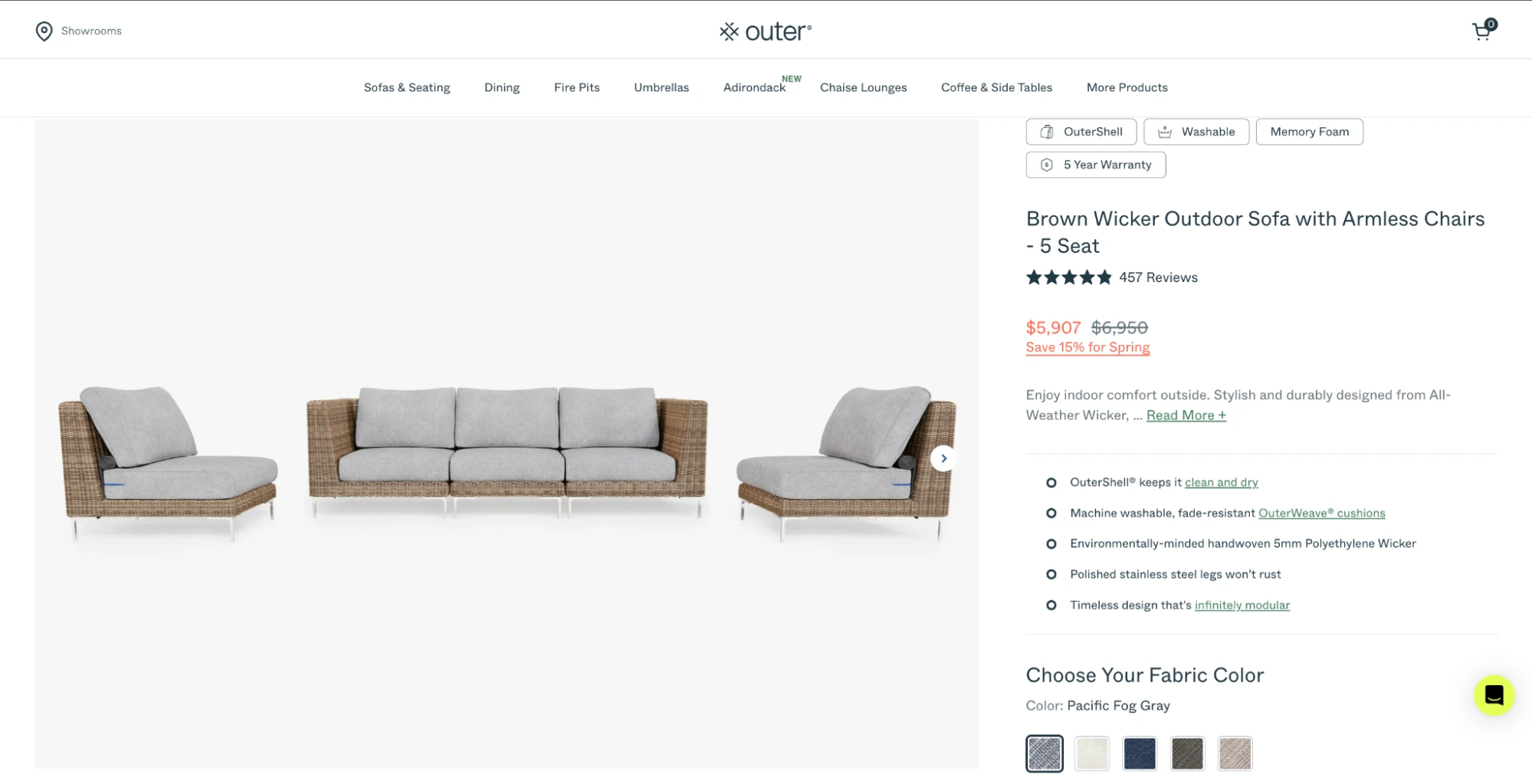
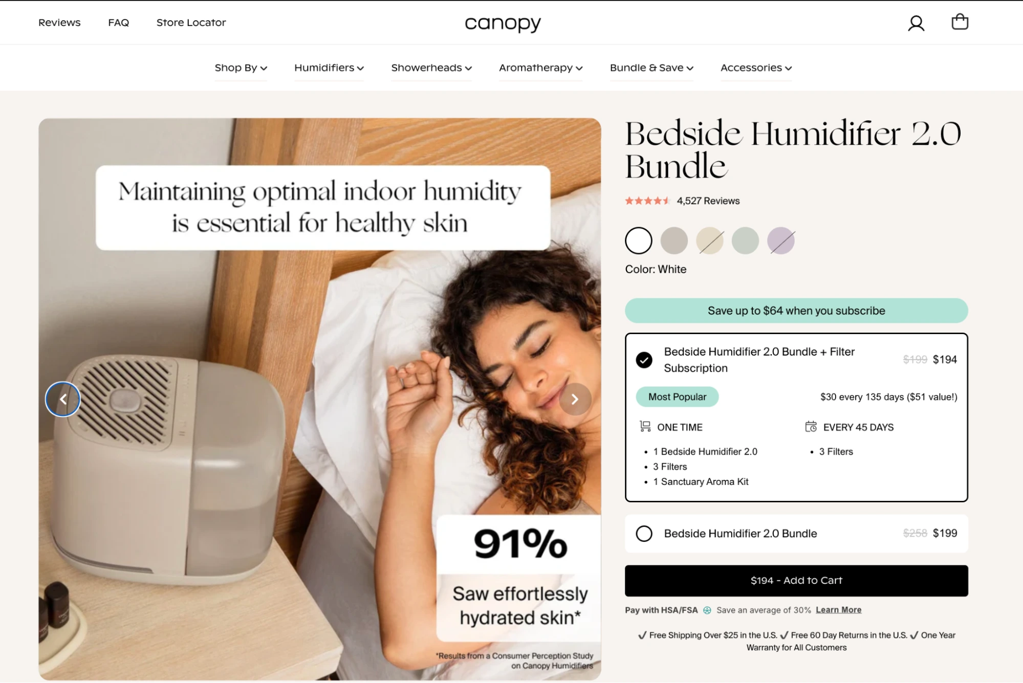
Outer’s product page is a masterclass in high-AOV ecommerce done right. From the outset, the page blends warm lifestyle photography with educational overlays (“Why Outer?”) and interactive features like their patented OuterShell demo. It’s designed to answer every question before it’s asked — from sustainability to warranty.
Takeaway: Premium product pages should feel premium. Layer trust, education, and design with intention.
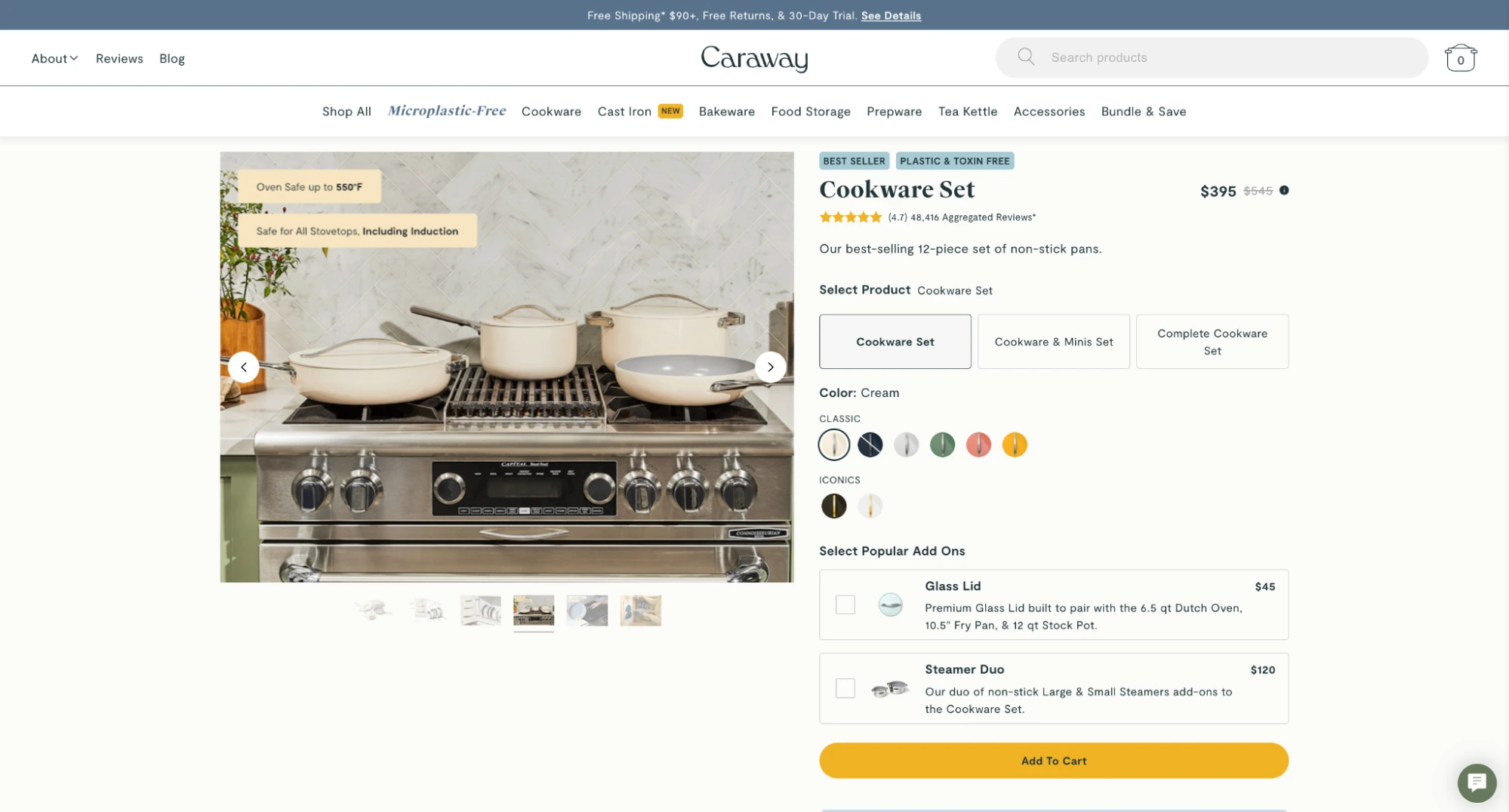
Caraway delivers visual storytelling through a clean, scroll-friendly layout. Color options are easy to browse, and the page walks you through materials, safety standards, and what’s included — all with minimalist animations and smooth UX.
Takeaway: For household essentials, show the product in context. Help shoppers visualize ownership with lifestyle imagery and layout clarity.
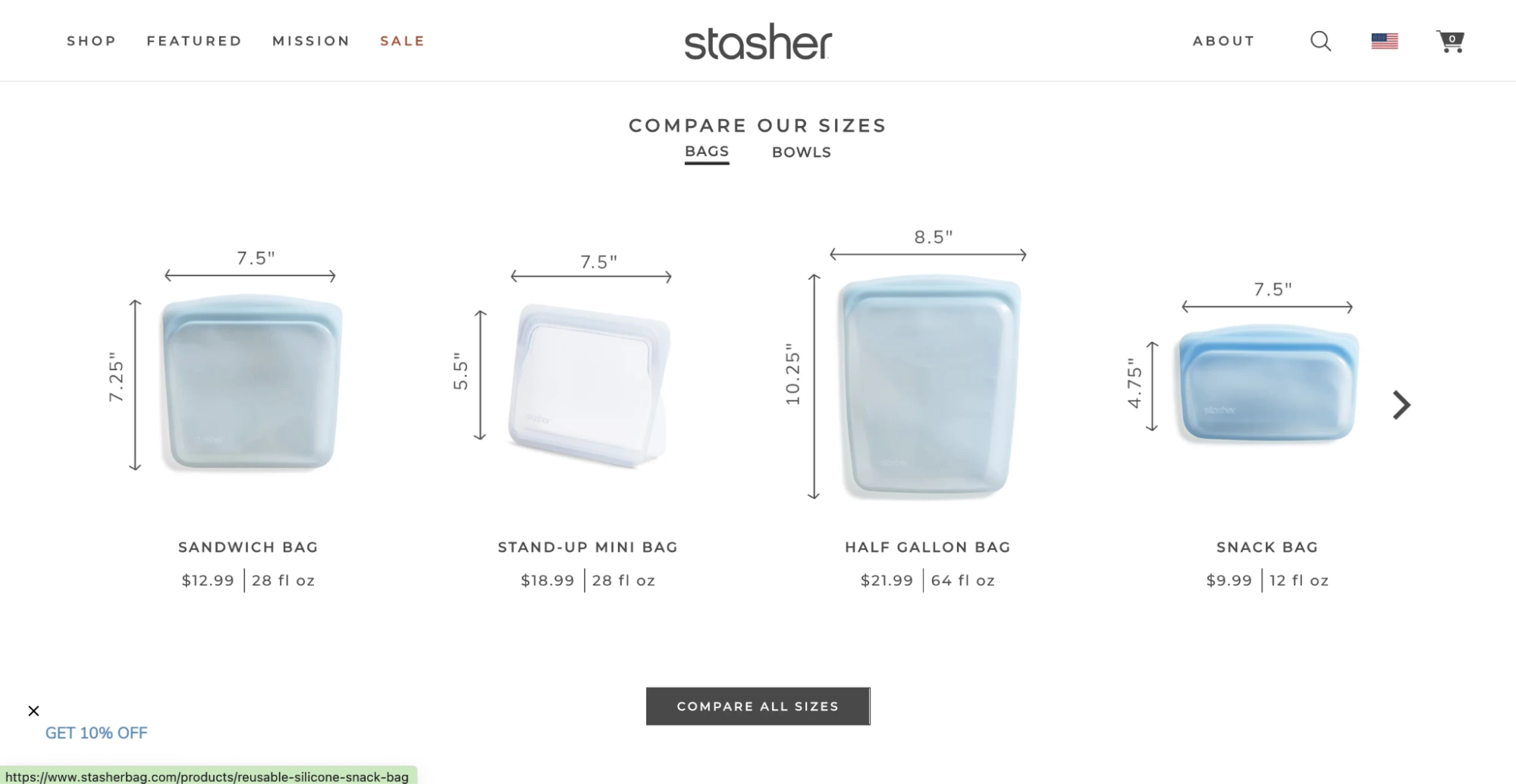
Stasher’s product page is clean, colorful, and to the point. It uses high-quality visuals, strong eco-positioning, and clearly listed benefits like dishwasher safety and plastic-free materials. Reviews and FAQs round out the experience.
Takeaway: When your product is simple, focus on clarity, visuals, and strong value messaging — and let the benefits speak for themselves.
This product page balances clean design with tons of layered detail. From performance specs and health benefits to bundle upsells and user testimonials, every scroll adds value. The animated explainer GIFs are subtle but highly effective.
Takeaway: Use lightweight motion (not autoplay videos) to educate without overwhelming — especially for functional products.
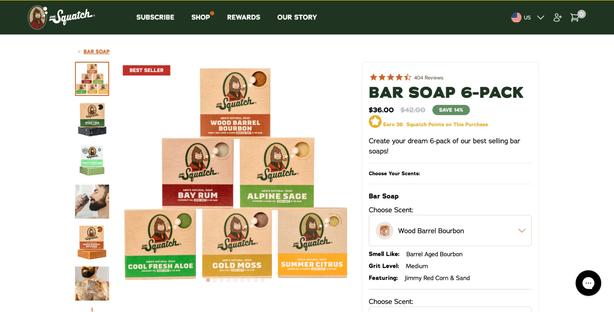
This page combines bold branding with conversion-driven design. From scent descriptions and ingredient callouts to a clean subscription toggle and 10K+ reviews, everything is built to drive trust and quick decision-making.
Takeaway: Strong branding paired with flexible buying options (like subscriptions) makes even everyday products feel premium — and keeps customers coming back.
Conclusion
Product page optimization works best when it’s grounded in clarity, trust, and a smooth path to purchase. Every detail — from how fast the page loads to how confidently a shopper can choose the right variant — plays a role in conversion.
In this guide, we covered the key elements that make a product page effective, the metrics that show whether it’s actually performing, and real examples from brands getting it right. Whether you’re refining one product or reworking your entire catalog, the same principles apply: focus on usability, relevance, and the shopper’s experience.
Start where it matters most, track your impact, and keep improving. A great product is built for the way your customers actually buy.
The category is: Serving Add-to-Cart energy!
Jasmine Khachatryan
With over five years of focused expertise in influencer marketing, Jasmine brings creativity, sharp strategic insight, and a proven track record to every project. Jasmine’s writing is an extension of her professional skill set, transforming complex topics into accessible, engaging content that informs and captivates readers. Her articles not only inform but entertain, transforming dry subjects into lively reads. This unique approach ensures that every piece is both insightful and enjoyable, leaving readers with valuable takeaways and a smile.
Comments
Leave a Reply
Shopify Marketing Automation 101: Because You’ve Got Better Things to Do


Comments