Discover the Insider Secrets of Million-Dollar Crowdfunding Campaigns
Some clients pay us over $1,000,000 to run their
multi-million-dollar crowdfunding campaigns. For the first time ever, we’re pulling back the
curtains and showing you how we do it.
How to develop a product everybody wants
How to get 100,000 visitors to your page
How to increase sales by over 37%
What services to use... and which ones you shouldn’t waste time on
Let’s be honest—online shoppers have the attention span of a goldfish with WiFi. One second they’re admiring your product, the next they’re watching a group cat yoga on TikTok.
So how do you keep them focused, interested, and most importantly—ready to click “Buy Now”? You hit them with a landing page that doesn’t just look good… it sells.
In this article, we’re diving into ecommerce landing page examples that do it right. The kind that makes people stop scrolling, start clicking, and maybe even forget they were just “browsing.” Whether you’re running paid ads, launching a product, or crafting your next seasonal promo, these pages are packed with steal-worthy ideas.
Let’s break down why landing pages matter, and then peek behind the curtain of brands that are absolutely crushing it.
Why Landing Pages Matter in Ecommerce
Sure, your homepage is doing the heavy lifting for your brand—but when it comes to converting visitors into customers, landing pages are where the magic happens.
Think of them as your ecommerce sniper: no distractions, no fluff, just one clean shot at conversion.
Here’s why they matter:
1. They focus on one goal (and one goal only)
Unlike homepages that try to be everything to everyone, a good landing page is built around a single call-to-action—whether that’s “Shop the Bundle,” “Start a Free Trial,” or “Claim Your Discount.” This focus is what drives results.
2. They’re optimized for ad traffic
Running Facebook, Instagram, or Google Ads? Sending users to your homepage is like dropping them in the middle of a mall without a map. A landing page matches your ad’s message and guides them exactly where you want them to go—fast.
3. They reduce bounce, increase conversions
By stripping out distractions (menus, pop-ups, sidebars, ten CTAs), landing pages give shoppers a smoother path to action. That means less confusion, more clicks, and better ROI. In fact, dedicated landing pages can convert 2 to 3 times more effectively than other pages.
4. They’re perfect for testing
Want to know if a different headline performs better? Or if a product video converts more than a static image? Landing pages are easy to A/B test and optimize, so you can keep tweaking for better performance.
Brands that use dedicated landing pages see up to a 5x increase in conversion rates compared to sending traffic to a general product page.
Whether you’re selling socks or skincare, launching something new or running a flash sale, a well-built landing page gives your campaign the focused firepower it needs.
Best Ecommerce Landing Page Examples
We’ve talked reasons—now let’s look at brands that do it like a pro. These ecommerce landing pages aren’t just pretty faces; they’re conversion machines. From product launches to personalized quizzes, each one nails the art of turning clicks into customers.
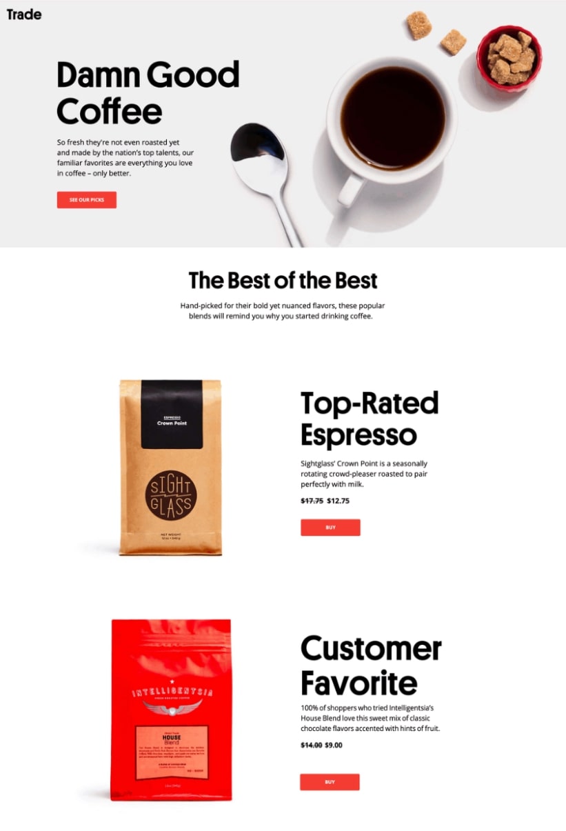
1. Trade Coffee – “Damn Good Coffee” Landing Page
Product-focused page showcasing top-rated coffee picks with direct-buy CTAs
Bold, no-nonsense, and deliciously scrollable—this landing page doesn’t waste time. With massive typography, clean product shots, and quick-hit CTAs, it keeps the shopping experience snappy. It’s built to convert curiosity into caffeine addiction.
Key Features That Work
Catchy headline (“Damn Good Coffee”) that instantly sets the tone
High-quality visuals and clear product descriptions
Visible discounts and red “Buy” buttons that pop
Ends with a quiz-style CTA (“Get Matched”) to keep the journey going
What You Can Learn from It
Don’t overcomplicate. Trade Coffee proves that letting the product shine—with great visuals, clear pricing, and bold copy—is often the most effective sales pitch.
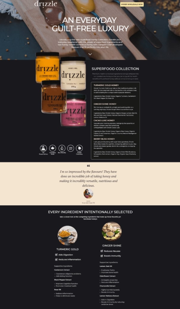
Sweet, sleek, and seriously strategic—this landing page does more than make you crave honey. It’s a wellness pitch wrapped in gorgeous visuals, storytelling, and education. From antioxidant benefits to ingredient deep dives, it builds trust and appetite, making it ideal for both B2B buyers and health-conscious consumers.
Key Features That Work
Elegant hero section with emotional hook: “An everyday guilt-free luxury”
Ingredient callouts with science-backed benefits (digestive support, immunity, antioxidants)
Social proof and press features add trust across every scroll
Education doesn’t have to be boring. Drizzle nails the art of turning product info into an experience, using visuals and language that make health benefits feel like indulgences.
3. SnackNation – “6 Snacks for $1” Landing Page
Subscription landing page offering a low-cost snack box trial
SnackNation’s landing page hits the sweet (and salty) spot for direct-to-consumer subscription boxes. Bright colors, bold typography, and irresistible value props make it nearly impossible to bounce. From the “6 Snacks for $1” headline to the FOMO-driven perks section, it’s a masterclass in DTC onboarding.
Key Features That Work
Loud, clear headline with numbers that pop: “6 Snacks for $1”
Step-by-step visual explainer (“How It Works”) keeps it simple and snackable
Product breakdown (“What’s in the Box”) builds anticipation with variety
Clear value exchange: complete a survey = keep paying $1
What You Can Learn from It
If you’re using an entry offer to bring people in, go all in on clarity and delight. SnackNation makes the offer feel exciting and easy while setting expectations from the start—no surprises, just snacks.
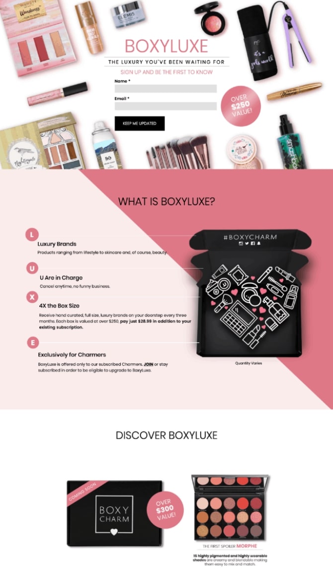
4. BoxyCharm – “The Luxury You’ve Been Waiting For” Landing Page
Email capture page teasing an exclusive beauty box upgrade
This page is pure glam with a clear purpose: build hype and collect emails. It nails the “coming soon” vibe with juicy product shots, luxe branding, and a bold promise of $250+ value. The short form keeps things frictionless, while the visuals do all the tempting.
Key Features That Work
Eye-catching hero section with bold typography and sleek flatlays
Simple email form front and center—no distractions
Smart use of value props like “4X the box size” and “Exclusively for Charmers”
Video + product spoilers = hype machine
What You Can Learn from It
Launching something new? Build anticipation with exclusivity, bold value props, and just enough spoiler content to keep them curious. BoxyCharm keeps it clean and focused, using visuals, exclusivity, and value to spark curiosity and capture leads early.
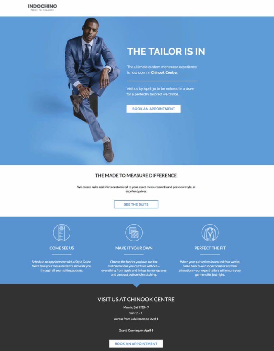
5. Indochino – “The Tailor Is In” Landing Page
Location-based landing page for booking in-store appointments at a custom menswear showroom
This landing page is as sharp as the suits it promotes. With crisp visuals, minimal copy, and a standout call to action, it’s tailored (pun intended) for local conversions. From hero to hashtag, every section guides you toward one goal: booking your custom fitting.
Key Features That Work
Striking hero image and headline that immediately anchor the message
Clear CTA (“Book an Appointment”) repeated at just the right moments
Informative icons that break down the experience into three digestible steps
Localized info (hours, directions, event dates) that removes friction
What You Can Learn from It
Location-specific landing pages don’t need to be complex—they just need to remove uncertainty and drive action. Indochino delivers by blending confidence-building visuals with clarity and convenience.
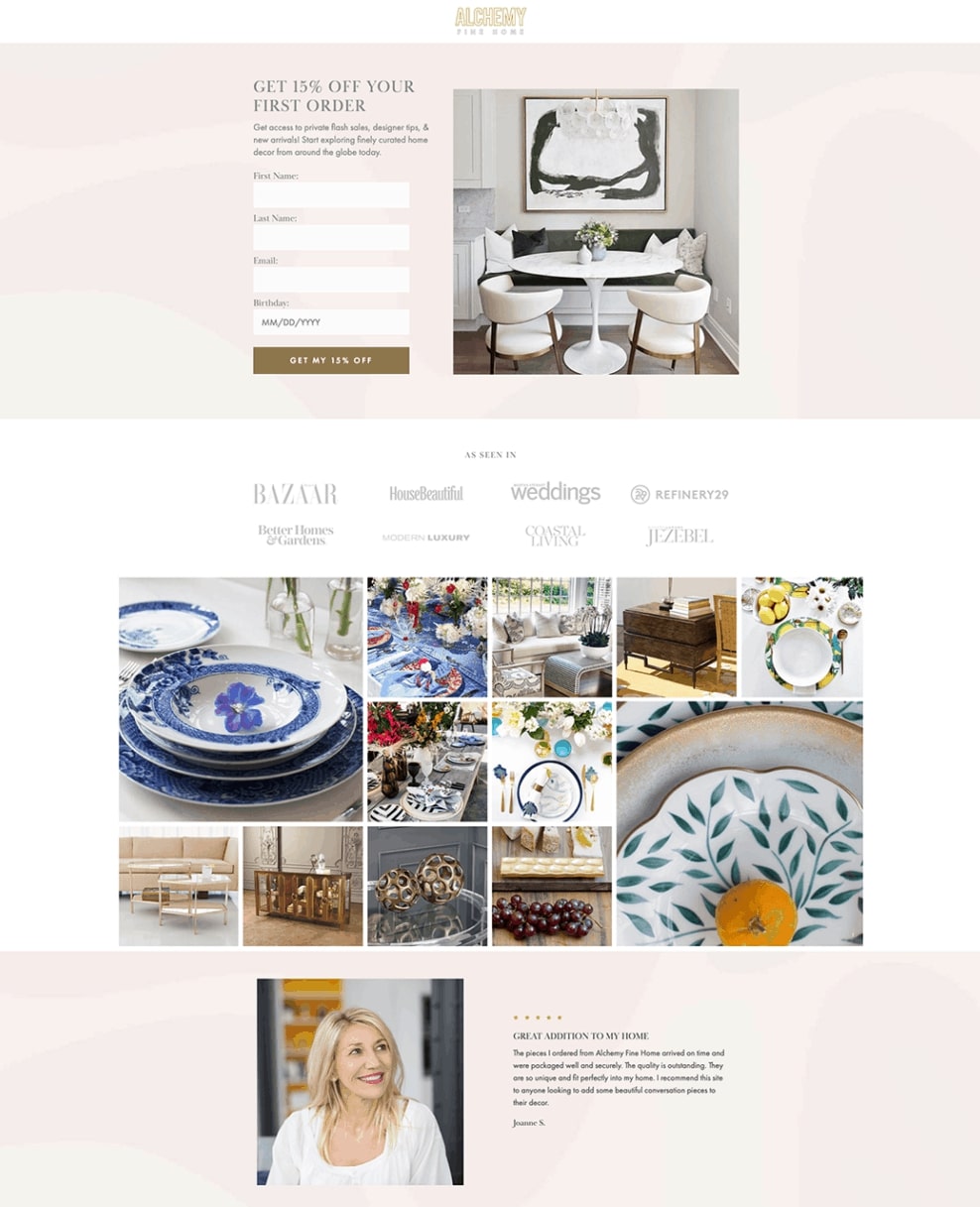
6. Alchemy Fine Home – “Get 15% Off” Landing Page
Lead-gen page offering a discount in exchange for email sign-up
Elegant and serene, this landing page mirrors the aesthetic of the brand’s luxury home décor. It’s refined and streamlined—with a soft color palette, a clear headline, and a no-pressure form that invites, not demands.
Key Features That Work
Discount-driven CTA right up top (“Get 15% Off Your First Order”)
Simple form with visual balance thanks to lifestyle photography
Trust elements via logos of top-tier press mentions
Lifestyle grid that shows the brand’s vibe (and dream home goals)
What You Can Learn from It
Luxury doesn’t shout—it whispers. This page proves that a soft, polished design with an incentive and social proof can drive sign-ups without feeling salesy.
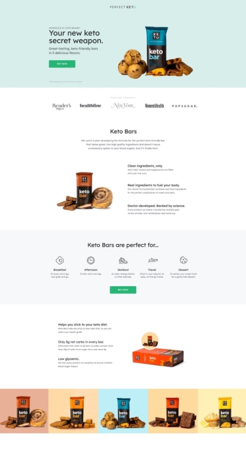
Ecommerce page for selling keto-friendly protein bars
This landing page is a smooth scroll through everything you need to hit “Add to Cart.” With great product visuals, bite-sized (pun intended) info, and trust signals galore, it checks every box for a high-performing ecommerce page.
Key Features That Work
Bold, benefit-first hero section (“Your new keto secret weapon”)
Product shots with flavor variety and lifestyle placement
Backed by real reviews, expert nods, and Amazon acclaim—it builds confidence with every scroll.
What You Can Learn from It
The more questions you answer up front, the more confident your customer becomes. Perfect Keto lays it all out—ingredients, benefits, timing, pricing—so there’s nothing left to second-guess.
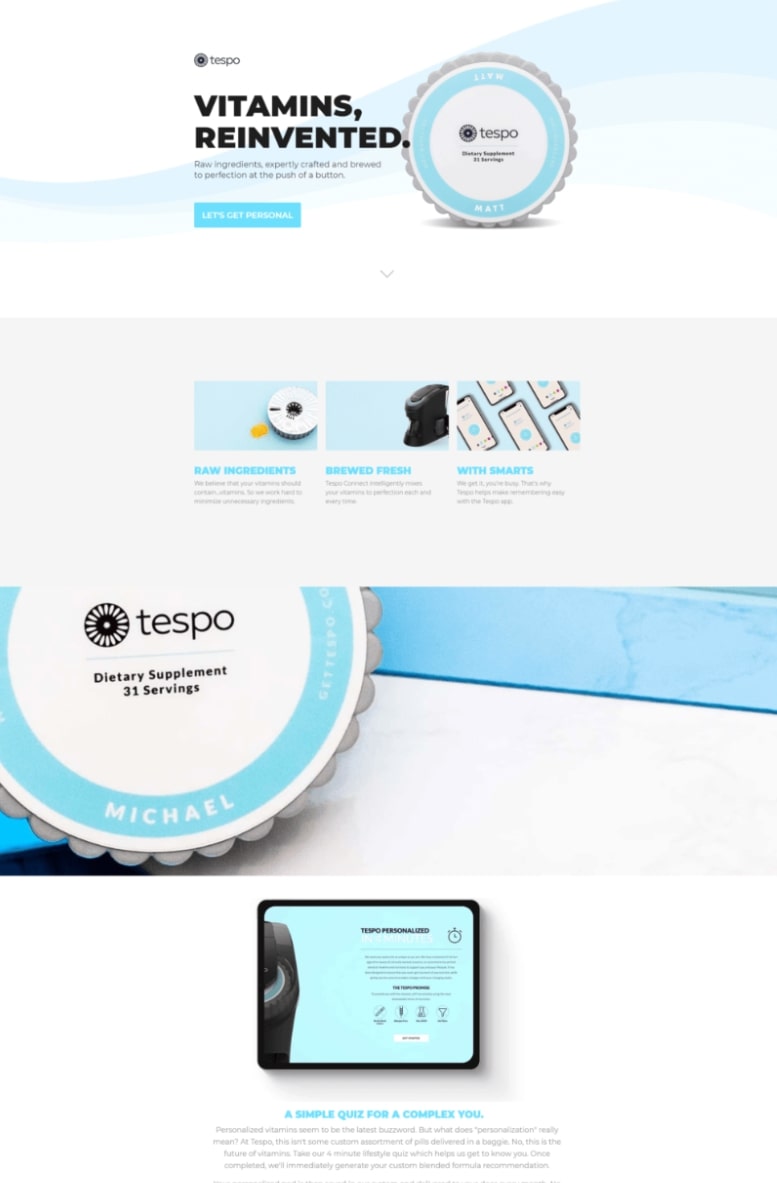
8. Tespo – “Vitamins, Reinvented” Landing Page
Lead-gen page promoting a smart, personalized vitamin solution
This page looks and feels like a next-gen health brand. Crisp design, futuristic visuals, and a “let’s get personal” message that keeps things friendly—not clinical. It’s part product intro, part quiz opt-in, and all about building hype around a better way to take your vitamins.
Key Features That Work
A crisp, tech-inspired layout that instantly signals innovation and credibility
A standout CTA (“Let’s Get Personal”) that’s playful and unmistakable
Clear breakdown of how Tespo works (ingredients, tech, personalization)
Quiz opt-in = lead capture meets interactivity
What You Can Learn from It
If your product is new or unconventional, focus on clarity, education, and curiosity. Tespo uses sleek design and friendly copy to explain its tech without overwhelming, while turning a quiz into a conversion funnel.
Conclusion
You don’t need a massive budget, a design award, or a celebrity endorsement to build a landing page that works. What these brands have in common isn’t just good looks—it’s strategic clarity. Every element has a purpose, every CTA earns its spot, and every scroll moves the user closer to a decision.
Whether you’re collecting leads, selling products, or teasing a big launch, the goal is the same: guide your visitor toward one action, with no friction and no fluff.
And remember: A great landing page isn’t a one-time build. It’s a test, tweak, and optimize kind of thing. Start simple, stay focused, and keep an eye on what actually converts.
Now go make your landing page so good, someone puts you on their swipe file.
Jasmine Khachatryan
With over five years of focused expertise in influencer marketing, Jasmine brings creativity, sharp strategic insight, and a proven track record to every project. Jasmine’s writing is an extension of her professional skill set, transforming complex topics into accessible, engaging content that informs and captivates readers. Her articles not only inform but entertain, transforming dry subjects into lively reads. This unique approach ensures that every piece is both insightful and enjoyable, leaving readers with valuable takeaways and a smile.
Comments
Leave a Reply
Shopify Migration: A Step-by-Step Guide to a Smooth Transition

Comments